Creating plots in R using ggplot2 - part 4: stacked bar plots
In this fourth tutorial I am doing with Mauricio Vargas Sepúlveda, we will demonstrate some of the many options the ggplot2 package has for creating and customising stacked bar plots. We will use the same dataset from the first post.
If you enjoyed this blog post and found it useful, please consider buying our book! It contains chapters detailing how to build and customise all 11 chart types published on the blog, as well as LOWESS charts. The book is also actively maintained (unlike the series on the blog) and contains up-to-date ggplot and tidyverse code, and every purchase really helps us out with keeping up with new content.
The first thing to do is load in the data and libraries, as below:
library(ggplot2)
library(ggthemes)
library(extrafont)
library(plyr)
library(scales)
charts.data <- read.csv("copper-data-for-tutorial.csv")
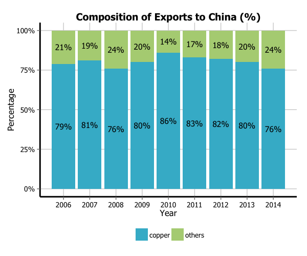
In this tutorial, we will work towards creating the bar plot below. We will take you from a basic stacked bar plot and explain all the customisations we add to the code step-by-step.
Basic graph
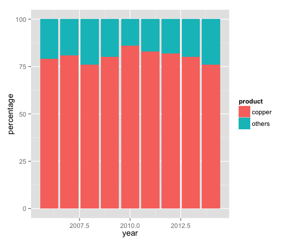
In order to initialise a plot we tell ggplot that charts.data is our data, and specify the variables on each axis. We then instruct ggplot to render this as a stacked bar plot by adding the geom_bar command.
charts.data <- read.csv("copper-data-for-tutorial.csv")

p4 <- ggplot() + geom_bar(aes(y = percentage, x = year, fill = product), data = charts.data,
                           stat="identity")
p4
Adding data labels
To label the bars according to some variable in the data, we add the label argument to the ggplot(aes()) option. In this case, we have labelled the bars with numbers from the export variable.
p4 <- p4 + geom_text(data=charts.data, aes(x = year, y = percentage,
                                             label = paste0(percentage,"%")), size=4)
p4
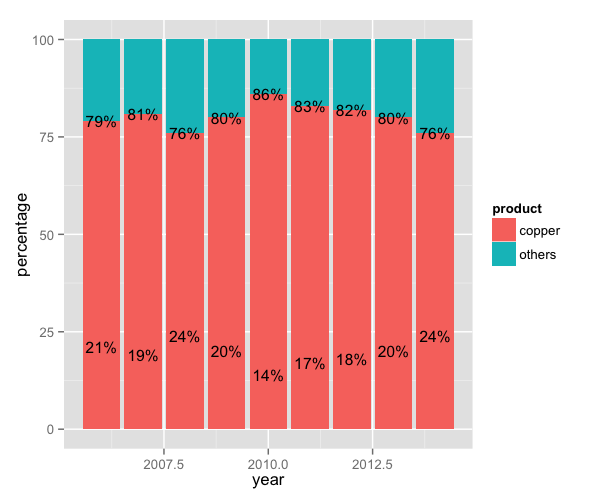
Adjusting data labels position
To adjust the position of the data labels from the default placement, we use the ddply function on the data, and create a new variable called pos. This variable is at the centre of each bar and can be used to specify the position of the labels by assigning it to the y argument in geom_text(aes()).
charts.data <- ddply(charts.data, .(year),
                     transform, pos = cumsum(percentage) - (0.5 * percentage))

p4 <- ggplot() + geom_bar(aes(y = percentage, x = year, fill = product), data = charts.data,
                           stat="identity")
p4 <- p4 + geom_text(data=charts.data, aes(x = year, y = pos, label = paste0(percentage,"%")),
                       size=4)
p4
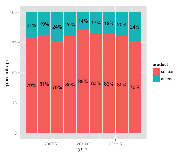
Adjusting legend position
To adjust the position of the legend from the default spot of right of the graph, we add the theme option and specify the legend.position="bottom" argument. We can also change the title to blank using the legend.title = element_blank() argument and change the legend shape using the legend.direction="horizontal" argument.
p4 <- p4 + theme(legend.position="bottom", legend.direction="horizontal",
                   legend.title = element_blank())
p4
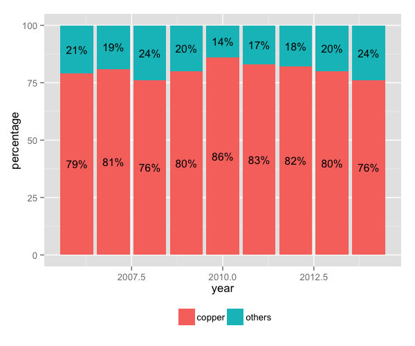
Changing variables display
To change the variables’ displayed name, we need to re-factor our data labels in charts.data data frame.
charts.data <- as.data.frame(charts.data)
charts.data$product <- factor(charts.data$product, levels = c("copper","others"),
                              labels = c("Copper","Pulp wood, Fruit, Salmon & Others"))

p4 <- ggplot() + geom_bar(aes(y = percentage, x = year, fill = product), data = charts.data,
                           stat="identity") +
  geom_text(data=charts.data, aes(x = year, y = pos,
                                  label = paste0(percentage,"%")), size=4) +
  theme(legend.position="bottom", legend.direction="horizontal", legend.title = element_blank())
p4

Adjusting x-axis scale
To change the axis tick marks, we use the scale_x_continuous and/or scale_y_continuous commands.
p4 <- p4 + scale_x_continuous(breaks=seq(2006,2014,1))
p4
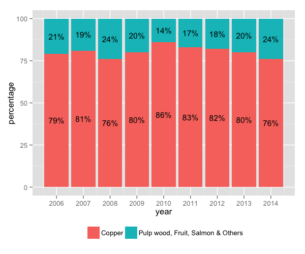
Adjusting axis, title & units
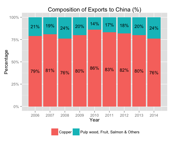
To add a title, we include the option ggtitle and include the name of the graph as a string argument, and to change the axis names we use the labs command.
p4 <- p4 + labs(x="Year", y="Percentage") +
  scale_y_continuous(labels = dollar_format(suffix = "%", prefix = "")) +
  ggtitle("Composition of Exports to China (%)")
p4
Adjusting color palette
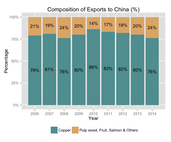
To change the colours, we use the scale_colour_manual command. Note that you can reference the specific colours you’d like to use with specific HEX codes. You can also reference colours by name, with the full list of colours recognised by R here.
fill <- c("#5F9EA0", "#E1B378")
p4 <- p4 + scale_fill_manual(values=fill)
p4
Using the white theme
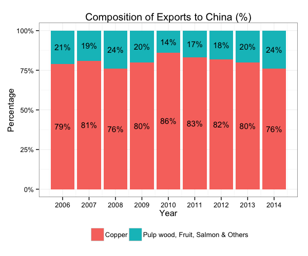
As explained in the previous posts, we can also change the overall look of the graph using themes. We’ll start using a simple theme customisation by adding theme_bw() after ggplot(). As you can see, we can further tweak the graph using the theme option, which we’ve used so far to change the legend.
p4 <- ggplot() + theme_bw() +
  geom_bar(aes(y = percentage, x = year, fill = product), data = charts.data, stat="identity") +
  geom_text(data=charts.data, aes(x = year, y = pos, label = paste0(percentage,"%")), size=4) +
  theme(legend.position="bottom", legend.direction="horizontal",
        legend.title = element_blank()) +
  scale_x_continuous(breaks=seq(2006,2014,1)) +
  scale_y_continuous(labels = dollar_format(suffix = "%", prefix = "")) +
  labs(x="Year", y="Percentage") +
  ggtitle("Composition of Exports to China (%)")
p4
Creating an XKCD style chart
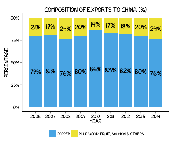
Of course, you may want to create your own themes as well. ggplot2 allows for a very high degree of customisation, including allowing you to use imported fonts. Below is an example of a theme Mauricio was able to create which mimics the visual style of XKCD. In order to create this chart, you first need to import the XKCD font, install it on your machine and load it into R using the extrafont package.
These instructions are taken from here:
library(extrafont)

download.file("http://simonsoftware.se/other/xkcd.ttf",
              dest="xkcd.ttf", mode="wb")
system("mkdir ~/.fonts")
system("cp xkcd.ttf  ~/.fonts")
font_import(paths = "~/.fonts", pattern="[X/x]kcd")
fonts()
loadfonts()
You can then create your graph:
#font_import(pattern="[X/x]kcd")
#fonts()

fill <- c("#56B4E9", "#F0E442")

p4 <- ggplot() +
  geom_bar(aes(y = percentage, x = year, fill = product), data = charts.data, stat="identity") +
  geom_text(data=charts.data, aes(x = year, y = pos, label = paste0(percentage,"%")),
            colour="black", family="xkcd-Regular", size = 5, show.legend = F) +
  theme(legend.position="bottom", legend.direction="horizontal",
        legend.title = element_blank()) +
  scale_x_continuous(breaks=seq(2006,2014,1)) +
  scale_y_continuous(labels = dollar_format(suffix = "%", prefix = "")) +
  labs(x="Year", y="Percentage") +
  ggtitle("Composition of Exports to China (%)") +
  scale_fill_manual(values=fill) +
  theme(axis.line = element_line(size=1, colour = "black"),
        panel.grid.major = element_blank(), panel.grid.minor = element_blank(),
        panel.border = element_blank(), panel.background = element_blank()) +
  theme(plot.title=element_text(family="xkcd-Regular"), text=element_text(family="xkcd-Regular"),
        axis.text.x=element_text(colour="black", size = 10),
        axis.text.y=element_text(colour="black", size = 10))
p4
Using ‘The Economist’ theme
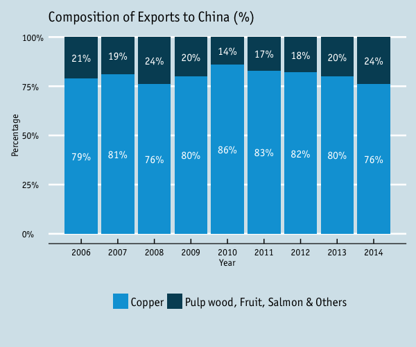
There are a wider range of pre-built themes available as part of the ggthemes package (more information on these here). Below we’ve applied theme_economist(), which approximates graphs in the Economist magazine. It is also important that the font change argument inside theme is optional and it’s only to obtain a more similar result compared to the original. For an exact result you need ‘Officina Sans’ which is a commercial font and is available here.
p4 <- ggplot() + theme_economist() + scale_fill_economist() +
  theme(plot.title=element_text(family="OfficinaSanITC-Book"),
        text=element_text(family="OfficinaSanITC-Book")) +
  geom_bar(aes(y = percentage, x = year, fill = product), data = charts.data, stat="identity") +
  geom_text(data=charts.data, aes(x = year, y = pos, label = paste0(percentage,"%")),
            colour="white", family="OfficinaSanITC-Book", size=4) +
  theme(legend.position="bottom", legend.direction="horizontal",
        legend.title = element_blank()) +
  scale_x_continuous(breaks=seq(2006,2014,1)) +
  scale_y_continuous(labels = dollar_format(suffix = "%", prefix = "")) +
  labs(x="Year", y="Percentage") +
  ggtitle("Composition of Exports to China (%)")
p4
Using ‘Five Thirty Eight’ theme
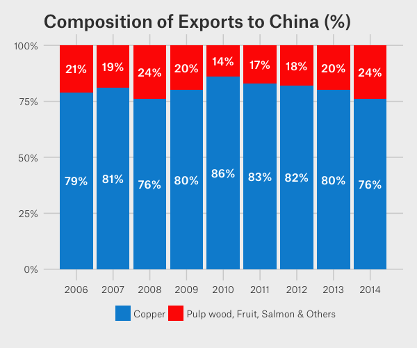
Below we’ve applied theme_fivethirtyeight(), which approximates graphs in the nice FiveThirtyEight website. Again, it is also important that the font change is optional and it’s only to obtain a more similar result compared to the original. For an exact result you need ‘Atlas Grotesk’ which is a commercial font and is available here.
p4 <- ggplot() + theme_fivethirtyeight() + scale_fill_fivethirtyeight() +
  theme(plot.title=element_text(family="Atlas Grotesk Medium"),
        text=element_text(family="Atlas Grotesk Light")) +
  geom_bar(aes(y = percentage, x = year, fill = product), data = charts.data, stat="identity") +
  geom_text(data=charts.data, aes(x = year, y = pos, label = paste0(percentage,"%")),
            colour="white", family="Atlas Grotesk Medium", size=4) +
  theme(legend.position="bottom", legend.direction="horizontal",
        legend.title = element_blank()) +
  scale_x_continuous(breaks=seq(2006,2014,1)) +
  scale_y_continuous(labels = dollar_format(suffix = "%", prefix = "")) +
  labs(x="Year", y="Percentage") +
  ggtitle("Composition of Exports to China (%)")
p4
Creating your own theme
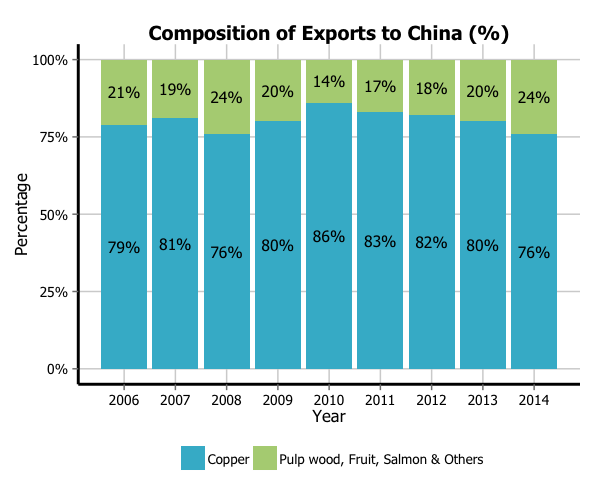
As before, you can modify your plots a lot as ggplot2 allows many customisations. Here we present our original result shown at the top of page.
fill <- c("#40b8d0", "#b2d183")

p4 <- ggplot() +
  geom_bar(aes(y = percentage, x = year, fill = product), data = charts.data, stat="identity") +
  geom_text(data=charts.data, aes(x = year, y = pos, label = paste0(percentage,"%")),
            colour="black", family="Tahoma", size=4) +
  theme(legend.position="bottom", legend.direction="horizontal",
        legend.title = element_blank()) +
  scale_x_continuous(breaks=seq(2006,2014,1)) +
  scale_y_continuous(labels = dollar_format(suffix = "%", prefix = "")) +
  labs(x="Year", y="Percentage") +
  ggtitle("Composition of Exports to China (%)") +
  scale_fill_manual(values=fill) +
  theme(axis.line = element_line(size=1, colour = "black"),
        panel.grid.major = element_line(colour = "#d3d3d3"), panel.grid.minor = element_blank(),
        panel.border = element_blank(), panel.background = element_blank()) +
  theme(plot.title = element_text(size = 14, family = "Tahoma", face = "bold"),
        text=element_text(family="Tahoma"),
        axis.text.x=element_text(colour="black", size = 10),
        axis.text.y=element_text(colour="black", size = 10))
p4
