Creating plots in R using ggplot2 - part 7: histograms
This is the seventh tutorial in a series on using ggplot2 I am creating with Mauricio Vargas Sepúlveda. In this tutorial we will demonstrate some of the many options the ggplot2 package has for creating and customising histograms. We will use R’s airquality dataset in the datasets package.
If you enjoyed this blog post and found it useful, please consider buying our book! It contains chapters detailing how to build and customise all 11 chart types published on the blog, as well as LOWESS charts. The book is also actively maintained (unlike the series on the blog) and contains up-to-date ggplot and tidyverse code, and every purchase really helps us out with keeping up with new content.
The first thing to do is load in the data, as below:
rm(list = ls())
library(datasets)
library(ggplot2)

data(airquality)
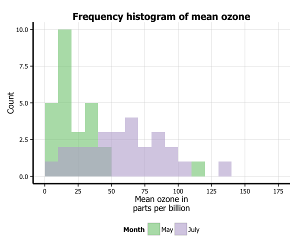
In this tutorial, we will work towards creating the histogram below. We will take you from a basic histogram and explain all the customisations we add to the code step-by-step.
Basic histogram
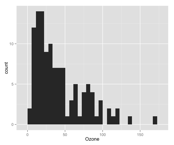
In order to initialise a plot we tell ggplot that airquality is our data, and specify that our x axis plots the Ozone variable. We then instruct ggplot to render this as a histogram by adding the geom_histogram() option.
p7 <- ggplot(airquality, aes(x = Ozone)) +
        geom_histogram()
p7
Adding a normal density curve
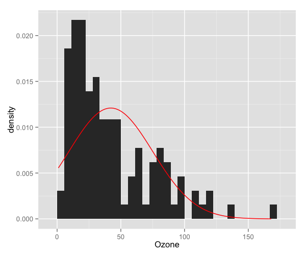
We can overlay a normal density function curve on top of our histogram to see how closely (or not) it fits a normal distribution. In this case, we can see it deviates from a normal distribution, showing marked positive skew. In order to overlay the function curve, we add the option stat_function(fun = dnorm), and specify the shape using the mean = mean(airquality$Ozone) and sd = sd(airquality$Ozone) arguments. If you have missing data like we did, make sure you pass the na.rm = TRUE argument to the mean and sd parameters. Finally, you can change the colour using the colour = "red" argument. We will discuss how to customise colours further below.
One further change we must make to display the normal curve correctly is adding aes(y = ..density..) to the geom_histogram option. Note that the normal density curve will not work if you are using the frequency rather than the density, which we are changing in our next step.
p7 <- ggplot(airquality, aes(x = Ozone)) +
        geom_histogram(aes(y = ..density..)) +
        stat_function(fun = dnorm, colour = "red",
                      arg = list(mean = mean(airquality$Ozone, na.rm = TRUE),
                                 sd = sd(airquality$Ozone, na.rm = TRUE)))
p7
Changing from density to frequency
Let’s go back to the basic plot and lose the function curve. To change the y-axis from density to frequency, we add the aes(y = ..count..) option to geom_histogram.
p7 <- ggplot(airquality, aes(x = Ozone)) +
        geom_histogram(aes(y = ..count..))
p7

Adjusting binwidth
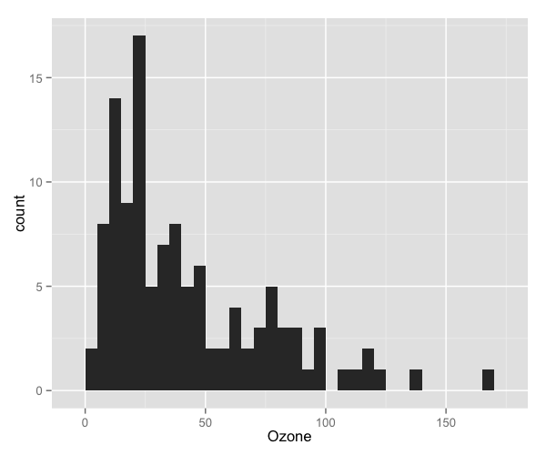
To change the binwidth, we add a binwidth argument to geom_histogram. In this case, we will make binwidth 5 units of the Ozone variable.
p7 <- ggplot(airquality, aes(x = Ozone)) +
        geom_histogram(aes(y = ..count..), binwidth = 5)
p7
Customising axis labels
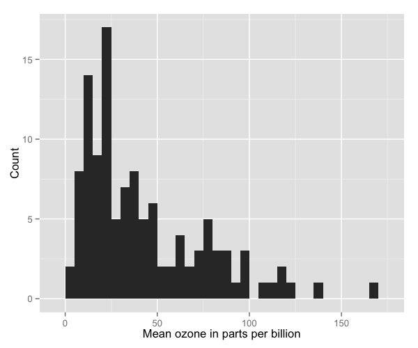
In order to change the axis labels, we have a couple of options. In this case, we have used the scale_x_continuous and scale_y_continuous options, as these have further customisation options for the axes we will use below. In each, we add the desired name to the name argument as a string.
p7 <- ggplot(airquality, aes(x = Ozone)) +
        geom_histogram(aes(y = ..count..), binwidth = 5) +
        scale_x_continuous(name = "Mean ozone in parts per billion") +
        scale_y_continuous(name = "Count")
p7
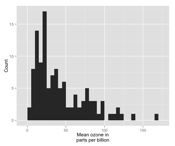
ggplot also allows for the use of multiline names (in both axes and titles). Here, we’ve changed the x-axis label so that it goes over two lines using the \n character to break the line.
p7 <- ggplot(airquality, aes(x = Ozone)) +
        geom_histogram(aes(y = ..count..), binwidth = 5) +
        scale_x_continuous(name = "Mean ozone in\nparts per billion") +
        scale_y_continuous(name = "Count")
p7
Changing axis ticks
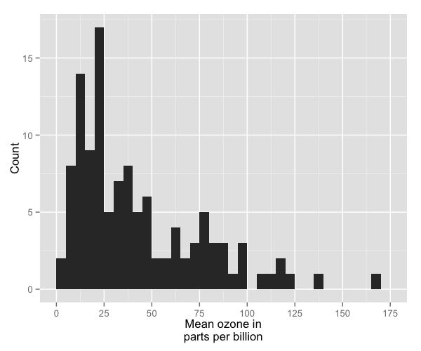
The next thing we will change is the axis ticks. Let’s make the x-axis ticks appear at every 25 units rather than 50 using the breaks = seq(0, 175, 25) argument in scale_x_continuous. (The seq function is a base R function that indicates the start and endpoints and the units to increment by respectively. See help(seq) for more information.) We ensure that the x-axis begins and ends where we want by also adding the argument limits = c(0, 175) to scale_x_continuous.
p7 <- ggplot(airquality, aes(x = Ozone)) +
        geom_histogram(aes(y = ..count..), binwidth = 5) +
        scale_x_continuous(name = "Mean ozone in\nparts per billion",
                           breaks = seq(0, 175, 25),
                           limits=c(0, 175)) +
        scale_y_continuous(name = "Count")
p7
Adding a title
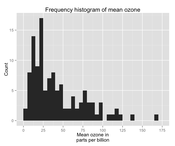
To add a title, we include the option ggtitle and include the name of the graph as a string argument.
p7 <- ggplot(airquality, aes(x = Ozone)) +
        geom_histogram(aes(y = ..count..), binwidth = 5) +
        scale_x_continuous(name = "Mean ozone in\nparts per billion",
                           breaks = seq(0, 175, 25),
                           limits=c(0, 175)) +
        scale_y_continuous(name = "Count") +
        ggtitle("Frequency histogram of mean ozone")
p7
Changing the colour of the bars
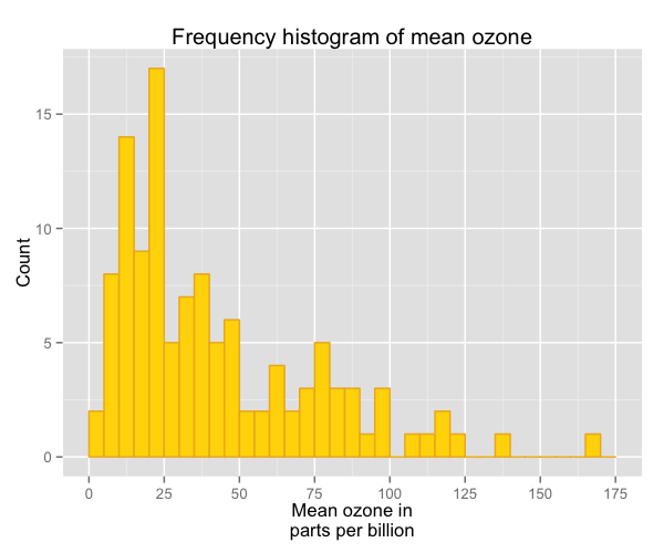
To change the line and fill colours of the bars, we add a valid colour to the colour and fill arguments in geom_histogram (note that I assigned these colours to variables outside of the plot to make it easier to change them). A list of valid colours is here.
barfill <- "gold1"
barlines <- "goldenrod2"

p7 <- ggplot(airquality, aes(x = Ozone)) +
        geom_histogram(aes(y = ..count..), binwidth = 5,
                       colour = barlines, fill = barfill) +
        scale_x_continuous(name = "Mean ozone in\nparts per billion",
                           breaks = seq(0, 175, 25),
                           limits=c(0, 175)) +
        scale_y_continuous(name = "Count") +
        ggtitle("Frequency histogram of mean ozone")
p7
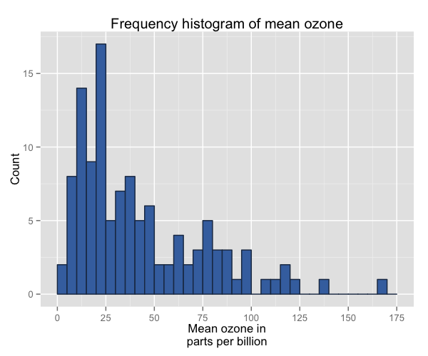
If you want to go beyond the options in the list above, you can also specify exact HEX colours by including them as a string preceded by a hash, e.g., “#FFFFFF”. Below, we have called two shades of blue for the fill and lines using their HEX codes.
barfill <- "#4271AE"
barlines <- "#1F3552"

p7 <- ggplot(airquality, aes(x = Ozone)) +
        geom_histogram(aes(y = ..count..), binwidth = 5,
                       colour = barlines, fill = barfill) +
        scale_x_continuous(name = "Mean ozone in\nparts per billion",
                           breaks = seq(0, 175, 25),
                           limits=c(0, 175)) +
        scale_y_continuous(name = "Count") +
        ggtitle("Frequency histogram of mean ozone")
p7
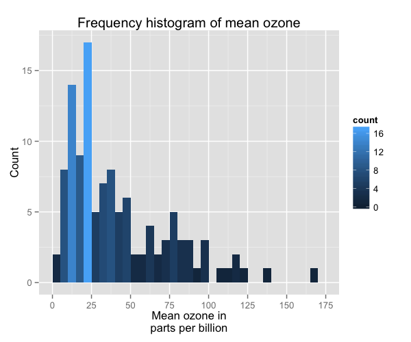
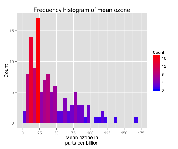
You can also add a gradient to your colour scheme that varies according to the frequency of the values. Below is the default gradient colour scheme. In order to do this, you can see we have changed the aes(y = ..count..) argument in geom_histogram to aes(fill = ..count..).
p7 <- ggplot(airquality, aes(x = Ozone)) +
        geom_histogram(aes(fill = ..count..), binwidth = 5) +
        scale_x_continuous(name = "Mean ozone in\nparts per billion",
                           breaks = seq(0, 175, 25),
                           limits=c(0, 175)) +
        scale_y_continuous(name = "Count") +
        ggtitle("Frequency histogram of mean ozone")
p7
You can customise the gradient by changing the anchoring colours for high and low. To do so, we have added the option scale_fill_gradient to the plot with the arguments Count (the name of the legend), low (the colour for the least frequent values) and high (the colour for the most frequent values).
p7 <- ggplot(airquality, aes(x = Ozone)) +
        geom_histogram(aes(fill = ..count..), binwidth = 5) +
        scale_x_continuous(name = "Mean ozone in\nparts per billion",
                           breaks = seq(0, 175, 25),
                           limits=c(0, 175)) +
        scale_y_continuous(name = "Count") +
        ggtitle("Frequency histogram of mean ozone") +
        scale_fill_gradient("Count", low = "blue", high = "red")
p7
Using the white theme
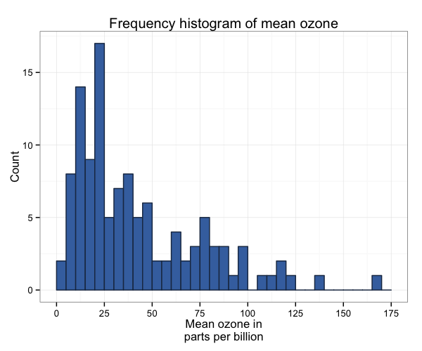
As explained in the previous posts, we can also change the overall look of the plot using themes. We’ll start using a simple theme customisation by adding theme_bw() after ggplot(). As you can see, we can further tweak the graph using the theme option, which we’ve used so far to change the legend.
barfill <- "#4271AE"
barlines <- "#1F3552"

p7 <- ggplot(airquality, aes(x = Ozone)) +
        geom_histogram(aes(y = ..count..), binwidth = 5,
                       colour = barlines, fill = barfill) +
        scale_x_continuous(name = "Mean ozone in\nparts per billion",
                           breaks = seq(0, 175, 25),
                           limits=c(0, 175)) +
        scale_y_continuous(name = "Count") +
        ggtitle("Frequency histogram of mean ozone") +
        theme_bw()
p7
Creating an XKCD style chart
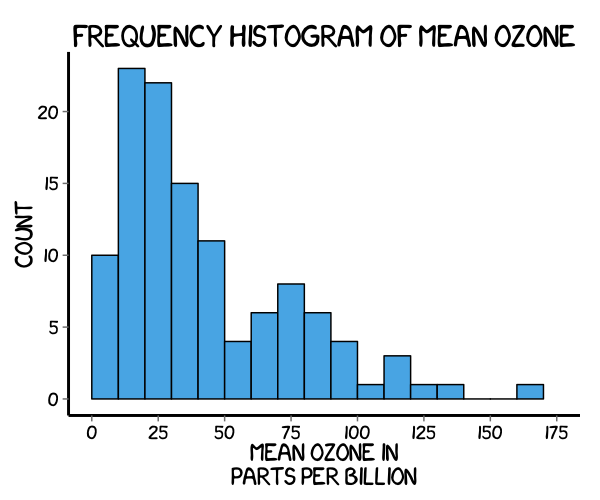
Of course, you may want to create your own themes as well. ggplot2 allows for a very high degree of customisation, including allowing you to use imported fonts. Below is an example of a theme Mauricio was able to create which mimics the visual style of XKCD. In order to create this chart, you first need to import the XKCD font, install it on your machine and load it into R using the extrafont package.
These instructions are taken from here:
library(extrafont)

download.file("http://simonsoftware.se/other/xkcd.ttf",
              dest="xkcd.ttf", mode="wb")
system("mkdir ~/.fonts")
system("cp xkcd.ttf  ~/.fonts")
font_import(paths = "~/.fonts", pattern="[X/x]kcd")
fonts()
loadfonts()
You can then create your graph:
p7 <- ggplot(airquality, aes(x = Ozone)) +
        geom_histogram(aes(y = ..count..), binwidth = 10,
                       colour = "black", fill = "#56B4E9") +
        scale_x_continuous(name = "Mean ozone in\nparts per billion",
                           breaks = seq(0, 175, 25),
                           limits=c(0, 175)) +
        scale_y_continuous(name = "Count") +
        ggtitle("Frequency histogram of mean ozone") +
        theme(axis.line = element_line(size=1, colour = "black"),
              panel.grid.major = element_blank(),
              panel.grid.minor = element_blank(),
              panel.border = element_blank(),
              panel.background = element_blank(),
              plot.title=element_text(size = 20, family="xkcd-Regular"),
              text=element_text(size = 16, family="xkcd-Regular"),
              axis.text.x=element_text(colour="black", size = 12),
              axis.text.y=element_text(colour="black", size = 12))
p7
Using ‘The Economist’ theme
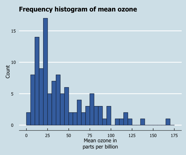
There are a wider range of pre-built themes available as part of the ggthemes package (more information on these here). Below we’ve applied theme_economist(), which approximates graphs in the Economist magazine.
library(ggthemes)

barfill <- "#4271AE"
barlines <- "#1F3552"

p7 <- ggplot(airquality, aes(x = Ozone)) +
        geom_histogram(aes(y = ..count..), binwidth = 5,
                   colour = barlines, fill = barfill) +
        scale_x_continuous(name = "Mean ozone in\nparts per billion",
                              breaks = seq(0, 175, 25),
                              limits=c(0, 175)) +
        scale_y_continuous(name = "Count") +
        ggtitle("Frequency histogram of mean ozone") +
        theme_economist() +
        theme(legend.position = "bottom", legend.direction = "horizontal",
              legend.box = "horizontal",
              legend.key.size = unit(1, "cm"),
              plot.title = element_text(family="Tahoma"),
              text = element_text(family = "Tahoma"),
              axis.title = element_text(size = 12),
              legend.text = element_text(size = 9),
              legend.title=element_text(face = "bold", size = 9))
p7
Creating your own theme
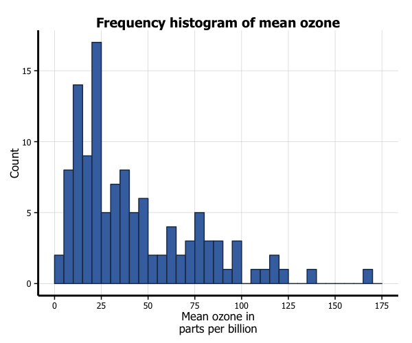
As before, you can modify your plots a lot as ggplot2 allows many customisations. Here is a custom plot where we have modified the axes, background and font.
library(grid)

barfill <- "#4271AE"
barlines <- "#1F3552"

p7 <- ggplot(airquality, aes(x = Ozone)) +
        geom_histogram(aes(y = ..count..), binwidth = 5,
                       colour = barlines, fill = barfill) +
        scale_x_continuous(name = "Mean ozone in\nparts per billion",
                           breaks = seq(0, 175, 25),
                           limits=c(0, 175)) +
        scale_y_continuous(name = "Count") +
        ggtitle("Frequency histogram of mean ozone") +
        theme_bw() +
        theme(axis.line = element_line(size=1, colour = "black"),
              panel.grid.major = element_line(colour = "#d3d3d3"),
              panel.grid.minor = element_blank(),
              panel.border = element_blank(), panel.background = element_blank(),
              plot.title = element_text(size = 14, family = "Tahoma", face = "bold"),
              text=element_text(family="Tahoma"),
              axis.text.x=element_text(colour="black", size = 9),
              axis.text.y=element_text(colour="black", size = 9))
p7
Adding lines
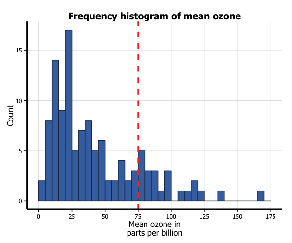
Let’s say that we want to add a cutoff value to the chart (75 parts of ozone per billion). We add the geom_vline option to the chart, and specify where it goes on the x-axis using the xintercept argument. We can customise how it looks using the colour and linetype arguments in geom_vline. (In the the same way, horizontal lines can be added using the geom_hline.)
barfill <- "#4271AE"
barlines <- "#1F3552"

p7 <- ggplot(airquality, aes(x = Ozone)) +
        geom_histogram(aes(y = ..count..), binwidth = 5,
                       colour = barlines, fill = barfill) +
        scale_x_continuous(name = "Mean ozone in\nparts per billion",
                           breaks = seq(0, 175, 25),
                           limits=c(0, 175)) +
        scale_y_continuous(name = "Count") +
        ggtitle("Frequency histogram of mean ozone") +
        theme_bw() +
        theme(axis.line = element_line(size=1, colour = "black"),
              panel.grid.major = element_line(colour = "#d3d3d3"),
              panel.grid.minor = element_blank(),
              panel.border = element_blank(), panel.background = element_blank(),
              plot.title = element_text(size = 14, family = "Tahoma", face = "bold"),
              text=element_text(family="Tahoma"),
              axis.text.x=element_text(colour="black", size = 9),
              axis.text.y=element_text(colour="black", size = 9)) +
        geom_vline(xintercept = 75, size = 1, colour = "#FF3721",
                   linetype = "dashed")
p7
Multiple histograms
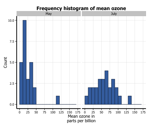
You can also easily create multiple histograms by the levels of another variable. There are two options, in separate (panel) plots, or in the same plot.
We first need to do a little data wrangling. In order to make the graphs a bit clearer, we’ve kept only months “5” (May) and “7” (July) in a new dataset airquality_trimmed. We also need to convert this variable into either a character or factor variable. We have created a new factor variable Month.f.
In order to produce a panel plot by month, we add the facet_grid(. ~ Month.f) option to the plot. The additional scale = free argument in facet_grid means that the y-axes of each plot do not need to be the same.
airquality_trimmed <- airquality[which(airquality$Month == 5 |
                                       airquality$Month == 7), ]
airquality_trimmed$Month.f <- factor(airquality_trimmed$Month,
                                     labels = c("May", "July"))

p7 <- ggplot(airquality_trimmed, aes(x = Ozone)) +
        geom_histogram(aes(y = ..count..), binwidth = 10,
                       colour = barlines, fill = barfill) +
        scale_x_continuous(name = "Mean ozone in\nparts per billion",
                           breaks = seq(0, 175, 25),
                           limits=c(0, 175)) +
        scale_y_continuous(name = "Count") +
        ggtitle("Frequency histogram of mean ozone") +
        theme_bw() +
        theme(axis.line = element_line(size=1, colour = "black"),
              panel.grid.major = element_line(colour = "#d3d3d3"),
              panel.grid.minor = element_blank(),
              panel.border = element_blank(), panel.background = element_blank(),
              plot.title = element_text(size = 14, family = "Tahoma", face = "bold"),
              text=element_text(family="Tahoma"),
              axis.text.x=element_text(colour="black", size = 9),
              axis.text.y=element_text(colour="black", size = 9)) +
        facet_grid(. ~ Month.f, scales = "free")
p7
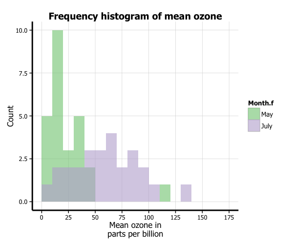
In order to plot the two months in the same plot, we add several things. Firstly, in the ggplot function, we add a fill = Month.f argument to aes. Secondly, in order to more clearly see the graph, we add two arguments to the geom_histogram option, position = "identity" and alpha = 0.6. This controls the position and transparency of the curves respectively. Finally, you can customise the colours of the histograms by adding the scale_fill_brewer to the plot from the RColorBrewer package. This blog post describes the available packages.
library(RColorBrewer)

p7 <- ggplot(airquality_trimmed, aes(x = Ozone, fill = Month.f)) +
        geom_histogram(aes(y = ..count..), binwidth = 10,
                       position="identity", alpha=0.6) +
        scale_x_continuous(name = "Mean ozone in\nparts per billion",
                           breaks = seq(0, 175, 25),
                           limits=c(0, 175)) +
        scale_y_continuous(name = "Count") +
        ggtitle("Frequency histogram of mean ozone") +
        theme_bw() +
        theme(axis.line = element_line(size=1, colour = "black"),
              panel.grid.major = element_line(colour = "#d3d3d3"),
              panel.grid.minor = element_blank(),
              panel.border = element_blank(), panel.background = element_blank(),
              plot.title = element_text(size = 14, family = "Tahoma", face = "bold"),
              text=element_text(family="Tahoma"),
              axis.text.x=element_text(colour="black", size = 9),
              axis.text.y=element_text(colour="black", size = 9)) +
        scale_fill_brewer(palette="Accent")
p7
Formatting the legend
Finally, we can format the legend. Firstly, we can change the position by adding the legend.position = "bottom" argument to the theme option, which moves the legend under the plot. Secondly, we can fix the title by adding the labs(fill="Month") option to the plot. We now have our final histogram.
p7 <- ggplot(airquality_trimmed, aes(x = Ozone, fill = Month.f)) +
        geom_histogram(aes(y = ..count..), binwidth = 10,
                   position="identity", alpha=0.6) +
        scale_x_continuous(name = "Mean ozone in\nparts per billion",
                              breaks = seq(0, 175, 25),
                              limits=c(0, 175)) +
        scale_y_continuous(name = "Count") +
        ggtitle("Frequency histogram of mean ozone") +
        theme_bw() +
        theme(axis.line = element_line(size=1, colour = "black"),
              panel.grid.major = element_line(colour = "#d3d3d3"),
              panel.grid.minor = element_blank(),
              panel.border = element_blank(), panel.background = element_blank(),
              plot.title = element_text(size = 14, family = "Tahoma", face = "bold"),
              text=element_text(family="Tahoma"),
              axis.text.x=element_text(colour="black", size = 9),
              axis.text.y=element_text(colour="black", size = 9),
              legend.position = "bottom", legend.position = "horizontal") +
        scale_fill_brewer(palette="Accent") +
        labs(fill="Month")
p7


