Creating plots in R using ggplot2 - part 11: linear regression plots
This is the eleventh tutorial in a series on using ggplot2 I am creating with Mauricio Vargas Sepúlveda. In this tutorial we will demonstrate some of the many options the ggplot2 package has for creating linear regression plots.
If you enjoyed this blog post and found it useful, please consider buying our book! It contains chapters detailing how to build and customise all 11 chart types published on the blog, as well as LOWESS charts. The book is also actively maintained (unlike the series on the blog) and contains up-to-date ggplot and tidyverse code, and every purchase really helps us out with keeping up with new content.
This post will be much more than showing you how to create regression plots. Here we are extracting, cleaning and processing financial data from Quandl.
Before going ahead, we strongly suggest to create a Quandl account in order to obtain an API key that allows you to download data without restrictions. It is even possible to log into Quandl using Github or Linkedin accounts. Quandl’s website has complete instruction and they have an API that is 100% R compatible.
The goal is to estimate the CAPM model \(R_i = R_f + \beta_i [R_m - R_f] + e_i\) where \(R_i\) is the return of an asset, \(R_f\) is the risk-free return (e.g. US Treasury Bonds), \(R_m\) is the return of the market portfolio (e.g. NYSE) and \(\beta_i\) is a measure of risk relative to the market (e.g. \(\beta_i = 1\) means that asset is exactly as risky as the market portfolio). More on the CAPM model can be read here, but in this tutorial we will focus on plotting.
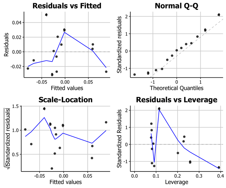
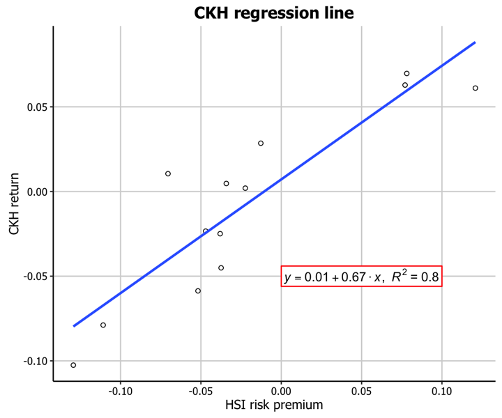
In this tutorial, we will work towards creating the trend line and diagnostics plots below. We will take you from a basic regression plot and explain all the customisations we add to the code step-by-step.


The first thing to do is download and load in the data of the monthly price of Hang Seng Index and Cheung Kong Holdings Hong Kong from 2015-03-01 to 2016-04-01.
library(ggplot2)
library(Quandl)
Quandl.api_key("XXX")

hsi.df <- Quandl("YAHOO/INDEX_HSI", start_date="2015-03-01", end_date="2016-04-01",
                 collapse="monthly", type = "raw")

ckh.df <- Quandl("YAHOO/HK_0001", start_date="2015-03-01",
                 end_date="2016-04-01", collapse="monthly", type = "raw")

saveRDS(hsi.df, "hsi.rds"); saveRDS(ckh.df,"ckh.rds")
Before calculating return as \(R_i = \displaystyle \frac{P_t - P_{t-1}}{P_t}\) we need to order HSI and CKH data by dates and in decreasing order.
hsi.df <- readRDS("hsi.rds")
colnames(hsi.df)[7] <- "Adjusted.Close"
hsi.df <- hsi.df[order(as.Date(hsi.df$Date)),]
With ordered dates it is possible to obtain the correct return for each month.
hsi.Adjusted.Close <- hsi.df$Adjusted.Close
hsi.Return <- diff(hsi.Adjusted.Close)/hsi.Adjusted.Close[-length(hsi.Adjusted.Close)]
hsi.Return <- c(NA,hsi.Return)
hsi.df$Return <- hsi.Return
hsi.df <- na.omit(hsi.df)
hsi.Return <- hsi.df[,c("Date","Return")]

ckh.df <- readRDS("ckh.rds")
colnames(ckh.df)[7] <- "Adjusted.Close"
ckh.df <- ckh.df[order(as.Date(ckh.df$Date)),]
ckh.Adjusted.Close <- ckh.df$Adjusted.Close
ckh.Return <- diff(ckh.Adjusted.Close)/ckh.Adjusted.Close[-length(ckh.Adjusted.Close)]
ckh.Return <- c(NA,ckh.Return)
ckh.df <- na.omit(ckh.df)
ckh.df$Return <- ckh.Return
ckh.Return <- ckh.df[,c("Date","Return")]
The returns can be arranged in one data frame before doing plots and regression.
hsi.ckh.returns <- merge(hsi.Return, ckh.Return, by='Date')
hsi.ckh.returns <- na.omit(hsi.ckh.returns)
colnames(hsi.ckh.returns) <- c("Date","hsi.Return","ckh.Return")
Using Damodaran and Bloomberg data we can work with an estimate of HSI risk premium over risk-free rate.
usa.risk.free <- 0.3/100
hsi.risk.premium <- 0.6/100
Trend line plot
Basic trend line plot
Now we can fit a linear regression. One interesting thing is that in CAPM context the regression line slope can be calculated as \(\beta_i = \displaystyle \frac{\sigma_{i,m}}{\sigma_m^2}\).
hsi.ckh.returns$hsi.Risk.free <- usa.risk.free + hsi.risk.premium
hsi.ckh.returns$hsi.Risk.premium <- hsi.ckh.returns$hsi.Return - hsi.ckh.returns$hsi.Risk.free
hsi.Return.vector <- as.vector(hsi.ckh.returns$hsi.Return)
ckh.Return.vector <- as.vector(hsi.ckh.returns$ckh.Return)
cov.hsi.ckh <- cov(ckh.Return.vector, hsi.Return.vector)
var.hk <- var(hsi.Return.vector)
capm_beta = cov.hsi.ckh/var.hk

fit <- lm(ckh.Return ~ hsi.Risk.premium, data = hsi.ckh.returns)
summary(fit)
Call:
lm(formula = ckh.Return ~ hsi.Risk.premium, data = hsi.ckh.returns)

Residuals:
      Min        1Q    Median        3Q       Max
-0.031033 -0.022800  0.001032  0.010137  0.050709

Coefficients:
                 Estimate Std. Error t value Pr(>|t|)
(Intercept)      0.007142   0.007437   0.960    0.357
hsi.Risk.premium 0.671372   0.101209   6.634 3.69e-05 ***
---
Signif. codes:  0 '***' 0.001 '**' 0.01 '*' 0.05 '.' 0.1 ' ' 1

Residual standard error: 0.02565 on 11 degrees of freedom
Multiple R-squared:    0.8, Adjusted R-squared:  0.7818
F-statistic:    44 on 1 and 11 DF,  p-value: 3.692e-05
Up to this point we have all we need to plot regressions. We will start with a basic regression plot.
p11 <- ggplot(hsi.ckh.returns, aes(x=hsi.Risk.premium, y=ckh.Return)) + geom_point(shape=1) + geom_smooth(method=lm)
p11
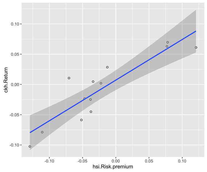
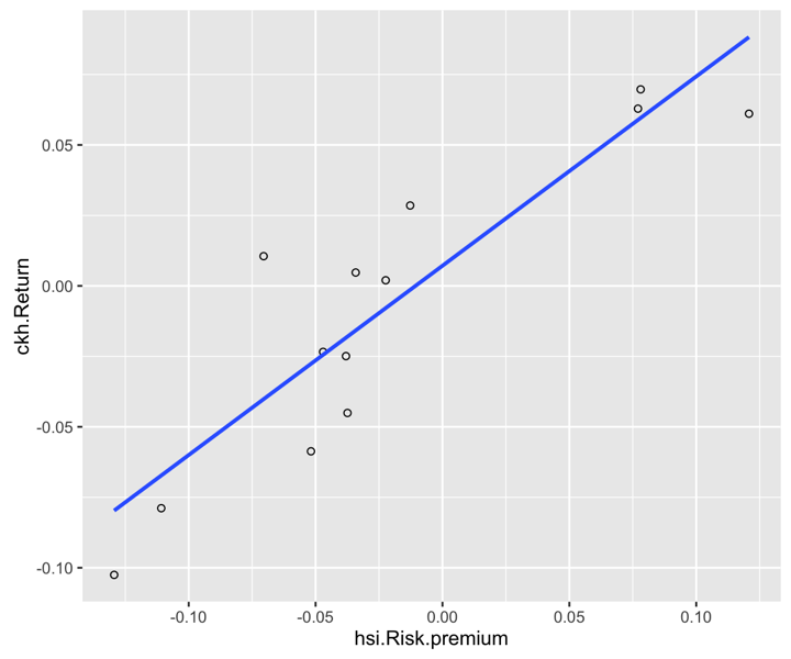
geom_smooth can be customized, for example, not to include the confidence region
p11 <- ggplot(hsi.ckh.returns, aes(x=hsi.Risk.premium, y=ckh.Return)) + geom_point(shape=1) + geom_smooth(method=lm, se=FALSE)
p11
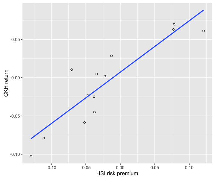
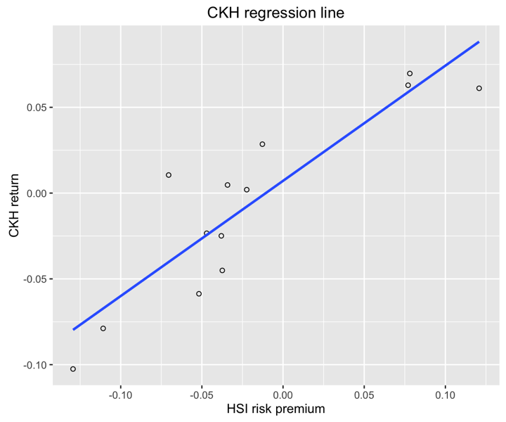
Before continuing it is a good idea to fix the axis labels and add a title.
Customising axis labels
We can change the text of the axis labels using the scale_x_continuous and scale_y_continuous options, with the names passed as a string to the name arguments in each.
p11 <- p11 + scale_x_continuous(name = "HSI risk premium") +
      scale_y_continuous(name = "CKH return")
p11
Adding a title
Similarly, we can add a title using the ggtitle option.
p11 <- p11 + ggtitle("CKH regression line")
p11
Including regression coefficients
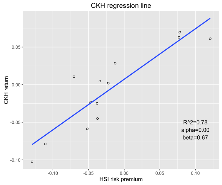
We can also include more information about the regression line itself. It would be interesting to show \(R^2\) and regression coefficients within the plot.
p11 <- p11 + annotate("text", x=0.1, y=-0.05, label = "R^2=0.78") +
      annotate("text", x=0.1, y=-0.06, label = "alpha=0.00") +
      annotate("text", x=0.1, y=-0.07, label = "beta=0.67")
p11
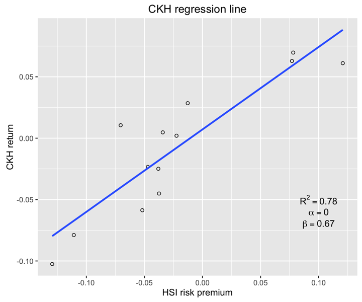
Another option would be to add greek letters and exponents.
p11 <- ggplot(hsi.ckh.returns, aes(x=hsi.Risk.premium, y=ckh.Return)) + geom_point(shape=1) +
      geom_smooth(method=lm, se=FALSE) + ggtitle("CKH regression line") +
      scale_x_continuous(name = "HSI risk premium") +
      scale_y_continuous(name = "CKH return") +
      annotate("text", x=0.1, y=-0.05, label = "R^2 == 0.78", parse=T) +
      annotate("text", x=0.1, y=-0.06, label = "alpha == 0.00", parse=T) +
      annotate("text", x=0.1, y=-0.07, label = "beta == 0.67", parse=T)
p11
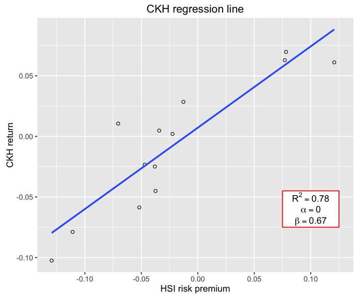
To make the coefficients more clear we will add some elements to increase visibility.
p11 <- ggplot(hsi.ckh.returns, aes(x=hsi.Risk.premium, y=ckh.Return)) +
      geom_point(shape=1) + geom_smooth(method=lm, se=FALSE) +
      ggtitle("CKH regression line") +
      scale_x_continuous(name = "HSI risk premium") +
      scale_y_continuous(name = "CKH return") +
      annotate("rect", xmin = 0.075, xmax = 0.125, ymin = -0.075, ymax = -0.045, fill="white", colour="red") +
      annotate("text", x=0.1, y=-0.05, label = "R^2 == 0.78", parse=T) + annotate("text", x=0.1, y=-0.06, label = "alpha == 0.00", parse=T) +
      annotate("text", x=0.1, y=-0.07, label = "beta == 0.67", parse=T)
p11
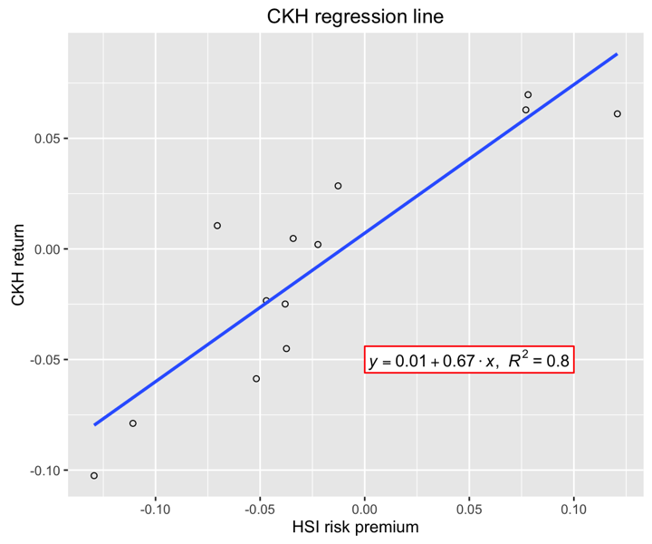
Another customization could be to show the trend line using rounded digits (or even significant digits) from regression coefficients. This requires us to write a function and is not as easy to obtain as the last plot.
equation = function(x) {
  lm_coef <- list(a = round(coef(x)[1], digits = 2),
                  b = round(coef(x)[2], digits = 2),
                  r2 = round(summary(x)$r.squared, digits = 2));
  lm_eq <- substitute(italic(y) == a + b %.% italic(x)*","~~italic(R)^2~"="~r2,lm_coef)
  as.character(as.expression(lm_eq));
}

p11 <- ggplot(hsi.ckh.returns, aes(x=hsi.Risk.premium, y=ckh.Return)) + geom_point(shape=1) + geom_smooth(method=lm, se=FALSE) +
      ggtitle("CKH regression line") +
      scale_x_continuous(name = "HSI risk premium") +
      scale_y_continuous(name = "CKH return") +
      annotate("rect", xmin = 0.00, xmax = 0.1, ymin = -0.056, ymax = -0.044, fill="white", colour="red") +
      annotate("text", x = 0.05, y = -0.05, label = equation(fit), parse = TRUE)
p11
Using the white theme
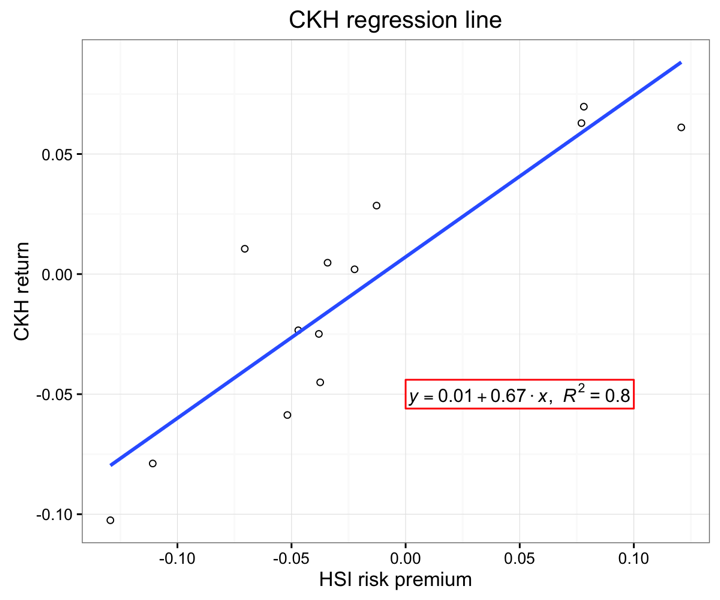
As explained in the previous posts, we can also change the overall look of the plot using themes. We’ll start using a simple theme customisation by adding theme_bw(). As you can see, we can further tweak the graph using the theme option, which we’ve used so far to change the legend.
p11 <- p11 + theme_bw()
p11
Creating an XKCD style chart
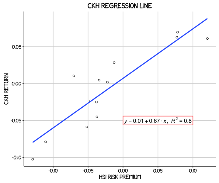
Of course, you may want to create your own themes as well. ggplot2 allows for a very high degree of customisation, including allowing you to use imported fonts. Below is an example of a theme Mauricio was able to create which mimics the visual style of XKCD. In order to create this chart, you first need to import the XKCD font, install it on your machine and load it into R using the extrafont package.
These instructions are taken from here:
library(extrafont)

download.file("http://simonsoftware.se/other/xkcd.ttf",
              dest="xkcd.ttf", mode="wb")
system("mkdir ~/.fonts")
system("cp xkcd.ttf  ~/.fonts")
font_import(paths = "~/.fonts", pattern="[X/x]kcd")
fonts()
loadfonts()
You can then create your graph:
p11 <- ggplot(hsi.ckh.returns, aes(x=hsi.Risk.premium, y=ckh.Return)) + geom_point(shape=1) + geom_smooth(method=lm, se=FALSE) +
      ggtitle("CKH regression line") +
      scale_x_continuous(name = "HSI risk premium") +
      scale_y_continuous(name = "CKH return") +
      annotate("rect", xmin = 0.00, xmax = 0.1, ymin = -0.056, ymax = -0.044, fill="white", colour="red") +
      annotate("text", x = 0.05, y = -0.05, label = equation(fit), parse = TRUE) +
      theme(axis.line.x = element_line(size=.5, colour = "black"),
            axis.line.y = element_line(size=.5, colour = "black"),
            axis.text.x=element_text(colour="black", size = 9),
            axis.text.y=element_text(colour="black", size = 9),
            panel.grid.major = element_line(colour = "#d3d3d3"),
            panel.grid.minor = element_blank(),
            panel.border = element_blank(), panel.background = element_blank(),
            plot.title = element_text(family = "xkcd-Regular"),
            text=element_text(family="xkcd-Regular"))
p11
Using ‘The Economist’ theme
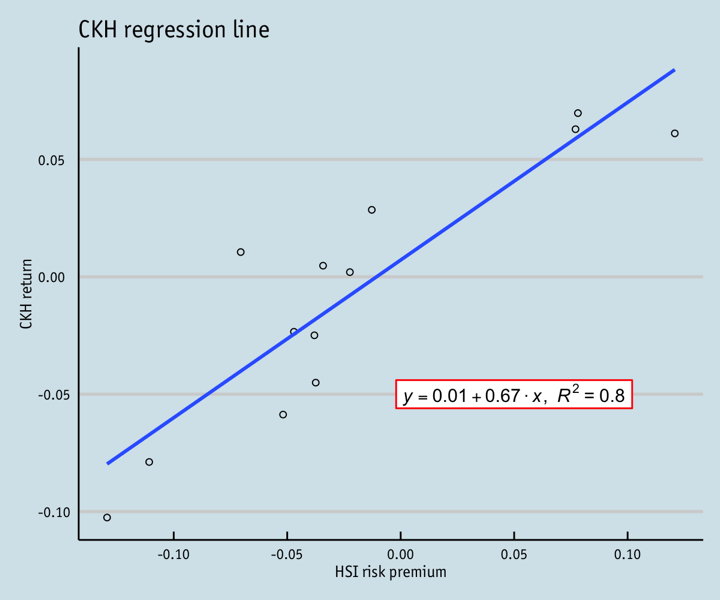
There are a wider range of pre-built themes available as part of the ggthemes package (more information on these here). Below we’ve applied theme_economist(), which approximates graphs in the Economist magazine.
library(ggthemes)
library(grid)

fill <- "#4271AE"
line <- "#1F3552"

p11 <- ggplot(hsi.ckh.returns, aes(x=hsi.Risk.premium, y=ckh.Return)) + geom_point(shape=1) + geom_smooth(method=lm, se=FALSE) +
      ggtitle("CKH regression line") +
      scale_x_continuous(name = "HSI risk premium") +
      scale_y_continuous(name = "CKH return") +
      annotate("rect", xmin = -0.002, xmax = 0.102, ymin = -0.056, ymax = -0.044, fill="white", colour="red") +
      annotate("text", x = 0.05, y = -0.05, label = equation(fit), parse = TRUE) +
      theme_economist() +
      theme(axis.line.x = element_line(size=.5, colour = "black"),
            axis.line.y = element_line(size=.5, colour = "black"),
            axis.text.x=element_text(colour="black", size = 9),
            axis.text.y=element_text(colour="black", size = 9),
            panel.grid.major = element_line(colour = "#d3d3d3"),
            panel.grid.minor = element_blank(),
            panel.border = element_blank(), panel.background = element_blank(),
            plot.title = element_text(family = "OfficinaSanITC-Book"),
            text=element_text(family="OfficinaSanITC-Book"))
p11
Creating your own theme
As before, you can modify your plots a lot as ggplot2 allows many customisations. Here is a custom plot where we have modified the axes, background and font.
library(grid)

fill <- "#4271AE"
lines <- "#1F3552"

p11 <- ggplot(hsi.ckh.returns, aes(x=hsi.Risk.premium, y=ckh.Return)) + geom_point(shape=1) + geom_smooth(method=lm, se=FALSE) +
      ggtitle("CKH regression line") +
      scale_x_continuous(name = "HSI risk premium") +
      scale_y_continuous(name = "CKH return") +
      annotate("rect", xmin = 0.00, xmax = 0.1, ymin = -0.056, ymax = -0.044, fill="white", colour="red") +
      annotate("text", x = 0.05, y = -0.05, label = equation(fit), parse = TRUE) +
      theme(axis.line.x = element_line(size=.5, colour = "black"),
            axis.line.y = element_line(size=.5, colour = "black"),
            axis.text.x=element_text(colour="black", size = 9),
            axis.text.y=element_text(colour="black", size = 9),
            legend.position = "bottom", legend.position = "horizontal",
            panel.grid.major = element_line(colour = "#d3d3d3"),
            panel.grid.minor = element_blank(),
            panel.border = element_blank(), panel.background = element_blank(),
            plot.title = element_text(size = 14, family = "Tahoma", face = "bold"),
            text=element_text(family="Tahoma"))
p11
Regression diagnostics plots
Basic diagnostics plots
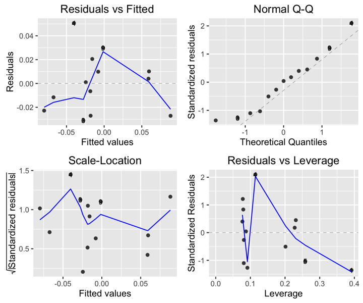
An important part of creating regression models is evaluating how well they fit the data. We can use the package ggfortify to let ggplot2 interpret lm objects and create diagnostic plots.
# install.packages("ggfortify")
library(ggfortify)
autoplot(fit, label.size = 3)
Using the white theme
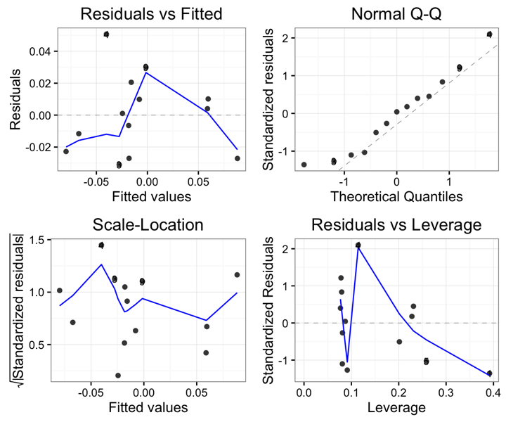
We can also customise the appearance of our diagnostic plots. Let’s first use the white theme by again adding theme_bw().
autoplot(fit, label.size = 3) + theme_bw()
Creating an XKCD style chart
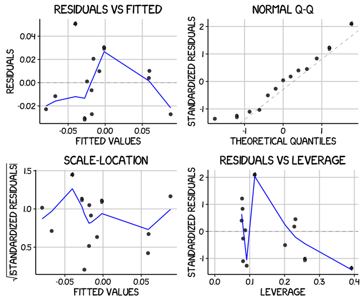
We can of course apply our other themes as well. Let’s try the XKCD theme.
autoplot(fit, label.size = 3) + theme(axis.line.x = element_line(size=.5, colour = "black"),
            axis.line.y = element_line(size=.5, colour = "black"),
            axis.text.x=element_text(colour="black", size = 9),
            axis.text.y=element_text(colour="black", size = 9),
            panel.grid.major = element_line(colour = "#d3d3d3"),
            panel.grid.minor = element_blank(),
            panel.border = element_blank(), panel.background = element_blank(),
            plot.title = element_text(family = "xkcd-Regular"),
            text=element_text(family="xkcd-Regular"))
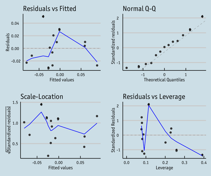
Using ‘The Economist’ theme
And now the Economist theme.
autoplot(fit, label.size = 3) + theme_economist() +
      theme(axis.line.x = element_line(size=.5, colour = "black"),
            axis.line.y = element_line(size=.5, colour = "black"),
            axis.text.x=element_text(colour="black", size = 9),
            axis.text.y=element_text(colour="black", size = 9),
            panel.grid.major = element_line(colour = "#d3d3d3"),
            panel.grid.minor = element_blank(),
            panel.border = element_blank(), panel.background = element_blank(),
            plot.title = element_text(family = "OfficinaSanITC-Book"),
            text=element_text(family="OfficinaSanITC-Book"))
Creating your own theme
Finally, we can also fully customise the diagnostic plots to match our regression plot simply by applying all of the same theme options.
autoplot(fit, label.size = 3) + theme(axis.line.x = element_line(size=.5, colour = "black"),
            axis.line.y = element_line(size=.5, colour = "black"),
            axis.text.x=element_text(colour="black", size = 9),
            axis.text.y=element_text(colour="black", size = 9),
            legend.position = "bottom", legend.position = "horizontal",
            panel.grid.major = element_line(colour = "#d3d3d3"),
            panel.grid.minor = element_blank(),
            panel.border = element_blank(), panel.background = element_blank(),
            plot.title = element_text(size = 14, family = "Tahoma", face = "bold"),
            text=element_text(family="Tahoma"))
