
Linear regression tools in R
Choosing the right linear regression model for your data can be an overwhelming venture, especially when you have a large number of available predictors. Luckily R has a wide array of in-built and user-written tools to make this process easier. In this week’s blog post I will describe some of the tools I commonly use.
For illustration I will use the mtcars dataset. The first step as always is to load in the data.
rm(list = ls())
data(mtcars)
I will also do a little bit of data cleaning by creating labelled factor variables for the categorical variables.
mtcars$am.f <- as.factor(mtcars$am); levels(mtcars$am.f) <- c("Automatic", "Manual")
mtcars$cyl.f <- as.factor(mtcars$cyl); levels(mtcars$cyl.f) <- c("4 cyl", "6 cyl", "8 cyl")
mtcars$vs.f <- as.factor(mtcars$vs); levels(mtcars$vs.f) <- c("V engine", "Straight engine")
mtcars$gear.f <- as.factor(mtcars$gear); levels(mtcars$gear.f) <- c("3 gears", "4 gears", "5 gears")
mtcars$carb.f <- as.factor(mtcars$carb)
We’re now ready to go through our model building tools. Similarly to last week’s blog post, I want to examine how well transmission type (am) predicts a car’s miles per gallon (mpg), taking into account other covariates and their interactions as appropriate.
Normality, linearity and multicollinearity
The first step to building the model is checking whether the data meet the assumptions of linear regression. A really neat way to simultaneously check the normality of the outcome, the linearity of the relationships between the outcome and the predictors and the intercorrelations between the predictors is the ggpairs plot in the very handy GGally R package. Before we run the ggpairs plot, I’ll rearrange the dataframe so the columns are in a more useful order for scanning the plot (with mpg and am as the first columns).
library(ggplot2); library(GGally)
mtcars <- mtcars[ , c(1, 9, 2:8, 10:16)]
g = ggpairs(mtcars[ , 1:11], lower = list(continuous = "smooth", params = c(method = "loess")))
g
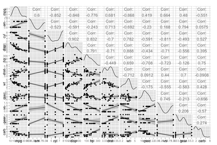
Note that this plot doesn’t work with factor variables, and the only categorical variables that should be included are either binary or ordinal. We can see that mpg is roughly normal (albeit a little positively skewed), and that the continuous variables and ordinal variables have linear relationship with mpg. We can also see there are a few very high intercorrelations between the potential predictor variables, but it is a little hard to pick these out in the volume of information.
A quick and easy alternative for finding collinear pairs is using the spec.cor function written by Joshua Wiley. This handy little function allows you to set a cutoff correlation level (in this case, 0.8), and it will return all pairs that correlate at or above that level.
spec.cor <- function (dat, r, ...) {
    x <- cor(dat, ...)
    x[upper.tri(x, TRUE)] <- NA
    i <- which(abs(x) >= r, arr.ind = TRUE)
    data.frame(matrix(colnames(x)[as.vector(i)], ncol = 2), value = x[i])
}

spec.cor(mtcars[ , 2:11], 0.8)
##     X1   X2      value
## 1 disp  cyl  0.9020329
## 2   hp  cyl  0.8324475
## 3   vs  cyl -0.8108118
## 4   wt disp  0.8879799
In this case we can see we have four collinear pairs of predictors. I’ve decided I will keep wt and discard disp, hp and vs. My choice was based on simple predictor reduction as I don’t know anything about the content area and variables, but I might have made a different decision (e.g., keeping hp and vs) if one of those variables was particularly important or interpretable.
Predictor selection
The next step is selecting the predictors to include in the model alongside am. As I don’t know anything about the predictors, I will select to enter them into the model based purely on their relationship with the outcome (with higher correlations meaning they will be entered sooner). I wrote a function below which correlates each predictor with the outcome and ranks them (as absolute values) in descending order.
cor.list <- c()
outcome.cor <- function(predictor, ...) {
    x <- cor(mtcars$mpg, predictor)
    cor.list <- c(cor.list, x)
}
cor.list <- sapply(mtcars[ , c(3, 6:8, 10:11)], outcome.cor)
sort(abs(cor.list), decreasing = TRUE)
##        wt       cyl      drat      carb      gear      qsec
## 0.8676594 0.8521620 0.6811719 0.5509251 0.4802848 0.4186840
You can see the predictor that has the strongest bivariate relationship with mpg is wt, then cyl, etc. We will use this order to enter variables into our model on top of am. One way of working out if adding a new variable improves the fit of the model is comparing models using the anova function. This function compares two nested models and returns the F-change and its associated significance level when adding the new variable(s).
When building the nested models, I will add one main effect at a time, following the bivariate relationship strength between each predictor and the outcome. I have written a function below which tests pairs of nested models and stores the two models and the significance of the F-change in a dataframe to make it easy to check whether a change improves the model fit. You can see I have run the models one by one and checked them, and only retained variables that improved model fit.
lmfits <- data.frame()
lmfit.table <- function(model1, model2, ...) {
    models <- sub("Model 1: ", "", attr(anova(model1, model2), "heading")[2])
    x <- c(sub("\\n.*", "", models),
           sub(".*Model 2: ", "", models),
           round(anova(model1, model2)$"Pr(>F)"[2], 3))
    lmfits <- rbind(lmfits, x)
}

model1 <- lm(mpg ~ am.f, data = mtcars)
model2 <- lm(mpg ~ am.f + wt, data = mtcars)

lmfits <- lmfit.table(model1, model2)
for (i in 1:3) {
    lmfits[ , i] <- as.character(lmfits[ , i])
}
names(lmfits) <- c("Model 1", "Model 2", "p-value of model improvement")

model3 <- lm(mpg ~ am.f + wt + cyl.f, data = mtcars)
lmfits <- lmfit.table(model2, model3)

model4 <- lm(mpg ~ am.f + wt + cyl.f + drat, data = mtcars)
lmfits <- lmfit.table(model3, model4)

model5 <- lm(mpg ~ am.f + wt + cyl.f + carb.f, data = mtcars)
lmfits <- lmfit.table(model3, model5)

model6 <- lm(mpg ~ am.f + wt + cyl.f + gear.f, data = mtcars)
lmfits <- lmfit.table(model3, model6)

model7 <- lm(mpg ~ am.f + wt + cyl.f + qsec, data = mtcars)
lmfits <- lmfit.table(model3, model7)

require(knitr)
lmfits
| Model 1 | Model 2 | p-value of model improvement |
|---|---|---|
| mpg ~ am.f | mpg ~ am.f + wt | 0 |
| mpg ~ am.f + wt | mpg ~ am.f + wt + cyl.f | 0.003 |
| mpg ~ am.f + wt + cyl.f | mpg ~ am.f + wt + cyl.f + drat | 0.861 |
| mpg ~ am.f + wt + cyl.f | mpg ~ am.f + wt + cyl.f + carb.f | 0.764 |
| mpg ~ am.f + wt + cyl.f | mpg ~ am.f + wt + cyl.f + gear.f | 0.564 |
| mpg ~ am.f + wt + cyl.f | mpg ~ am.f + wt + cyl.f + qsec | 0.061 |
There were two variables that improved model fit in addition to am, which were wt and cyl. I will now check whether adding interaction terms between these variables and these variables improves model fit:
model8 <- lm(mpg ~ am.f + wt + cyl.f + am.f * wt, data = mtcars)
lmfits <- lmfit.table(model3, model8)

model9 <- lm(mpg ~ am.f + wt + cyl.f + am.f * wt + am.f * cyl.f, data = mtcars)
lmfits <- lmfit.table(model8, model9)

model10 <- lm(mpg ~ am.f + wt + am.f * wt, data = mtcars)
lmfits <- lmfit.table(model2, model10)

lmfits[7:9, ]
| Model 1 | Model 2 | p-value of model improvement |
|---|---|---|
| mpg ~ am.f + wt + cyl.f | mpg ~ am.f + wt + cyl.f + am.f * wt | 0.007 |
| mpg ~ am.f + wt + cyl.f + am.f * wt | mpg ~ am.f + wt + cyl.f + am.f * wt + am.f * cyl.f | 0.802 |
| mpg ~ am.f + wt | mpg ~ am.f + wt + am.f * wt | 0.001 |
We now have two viable models, model8 and model10. To select between these, I will have a look at the \(R^2\) and variance inflation factor (VIF) (in the car package) of each of the models.
require(car)
round(summary(model10)$r.squared, 3)
## [1] 0.833
vif(model10)
##      am.f        wt   am.f:wt
## 20.901259  2.728248 15.366853
round(summary(model8)$r.squared, 3)
## [1] 0.877
vif(model8)[ , 1]
##      am.f        wt     cyl.f   am.f:wt
## 24.302147  3.983261  3.060691 18.189413
The difference in \(R^2\) between the two models is small, but the inclusion of cyl in the model both increases the variance inflation and decreases the interpretability of the model. Moreover, cyl is highly correlated with wt (0.782), meaning it is likely explaining a lot of the same variance as wt. As such, I dropped cyl and the final model included am, wt, and their interaction term.
Model diagnostics
Having chosen the final model, it is time to check whether it has any issues with how it fits the data. The built-in plot function conveniently displays four diagnostic plots for lm objects:
final.model <- lm(mpg ~ am.f + wt + am.f * wt, data = mtcars)
par(mfrow = c(2,2))
plot(final.model)
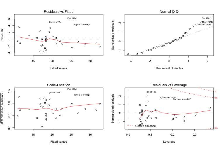
The Residuals vs Fitted plot (and its standardised version, the Scale Location plot) show that higher MPG values tend to have higher residuals. In addition, there are three values with unusually high residual error (Merc 240DD, Fiat128 and Toyota Corolla), indicating that the model is a poor fit for both cars with high MPG (past about 28 MPG) and these three car types. The Normal Q-Q plot of residuals indicates that the errors are not normally distributed, again especially for high levels of MPG and the three specific car models that had high residuals. Finally, the Residuals vs Leverage plot demonstrates that are a couple of values with high leverage and low residuals, which may possibly be biasing the trend line.
To more closely examine the effect of variables with high leverage and/or influence on the regression line we can extract the hatvalues and the dfbeta values of the model respectively. First I will show the top 6 hatvalues:
mtcars$name <- row.names(mtcars)
mtcars$hatvalues <- round(hatvalues(final.model), 3)
top.leverage = sort(round(hatvalues(final.model), 3), decreasing = TRUE)
head(top.leverage)
##       Maserati Bora Lincoln Continental   Chrysler Imperial
##               0.371               0.304               0.281
##  Cadillac Fleetwood        Lotus Europa         Honda Civic
##               0.254               0.253               0.216
The Maserati Bora appears to have a substantially higher leverage than the others in the list. Ok, so now let’s look at the dfbetas:
mtcars$dfbetas <- round(dfbetas(final.model)[, 2], 3)
top.influence = sort(round(abs(dfbetas(final.model)[, 2]), 3), decreasing = TRUE)
head(top.influence)
## Chrysler Imperial    Toyota Corolla      Lotus Europa         Merc 240D
##             0.584             0.469             0.372             0.349
##          Fiat 128          Merc 230
##             0.327             0.231
Despite its high leverage, the Maserati Bora does not have high influence. Instead, the Chrysler Imperial and the Toyota Corolla are much higher than the other models. So how do we actually tell if these values are biasing the fit of the regression line? I wrote two ggplots which label the data points by name with the highest leverage and influence values. I chose the three highest, but you can easily change the code to give you whatever number you want.
# First build a plot of the model.
library(ggplot2)
gp <- ggplot(data=mtcars, aes(x=wt, y=mpg, colour=am.f)) +
        geom_point(alpha = 0.7) +
        geom_abline(intercept = coef(final.model)[1], slope = coef(final.model)[3],
                    size = 1, color = "#FF3721") +
        geom_abline(intercept = coef(final.model)[1] + coef(final.model)[2],
                    slope = coef(final.model)[3] + coef(final.model)[4],
                    size = 1, color = "#4271AE") +
        scale_colour_manual(name="Transmission", values =c("#FF3721", "#4271AE")) +
        ylab("Miles per gallon") +
        xlab("Weight (`000 lbs)") +
        theme_bw()

# Leverage plot
g1 <- gp + geom_text(data=subset(mtcars, abs(hatvalues) >= top.leverage[3]),
                     aes(wt,mpg,label=name), size = 4, hjust=1, vjust=0) +
        ggtitle("Three Points with Highest Leverage (hatvalues)")

# Influence plot
g2 <- gp + geom_text(data=subset(mtcars, abs(dfbetas) == top.influence[1]),
                     aes(wt,mpg,label=name), size = 4, hjust = 1, vjust = 0) +
        geom_text(data=subset(mtcars, abs(dfbetas) == top.influence[2] |
                                  abs(dfbetas) == top.influence[3]),
                     aes(wt,mpg,label=name), size = 4, hjust = 0, vjust = 0) +
        ggtitle("Three Points with Highest Influence (dfbetas)")

library(gridExtra)
grid.arrange(g1, g2, nrow = 1, ncol = 2)
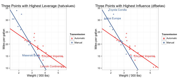
You can see that none of the high leverage nor influence points seem to be biasing the fit of the regression lines.
I hope this post has given you some useful tools to streamline your linear regression model-building process. I hope you can also see that while all of the decisions I made were data-driven, several were ultimately subjective, and there were a few alternative models that may have worked equally well. This highlights the fact that the “right” model is dependent on what you’re going to use it for, the overall interpretability, and what the content expert tells you is important.

(Image via Research Wahlberg)
I have taken some of the information and code used in this post from the excellent Regression Models unit on Coursera by Brian Caffo, Jeff Leek and Roger Peng, and the model used was derived from work I did for the class assignment for that course.
Finally, the full code used to create the figures in this post is located in this gist on my Github page.