What are the most popular Christmas movies according to MovieLens 10M?
It has been another scorching Christmas season in Melbourne, so I have been hiding in the aircon for the last week catching up on my holiday movie list. I also recently (serendipitously) discovered the wonderful MovieLens datasets and have been messing around doing some analyses with them, so I got curious about whether my favourite Christmas movies are in these datasets and what the raters actually think about them. I mean, I know in my heart that ‘Die Hard’ and ‘Love Actually’ are Christmas classics, but would the data agree with me?
To answer my questions, I used the MovieLens 10M, which has ratings up to 2009, and a list of the top 50 Christmas movies from Time Out London.

Setting up the virtualenv
To set up the environment for this analysis, I created a new virtualenv (see this blog post for how to do this) and installed the following packages:
!pip install lxml
!pip install cssselect
!pip install requests
!pip install mysql-connector-python
!pip install numpy
!pip install pandas
!pip install matplotlib
!pip install jupyter
I then opened a new Jupyter notebook to run the rest of the analyses, but any Python IDE will of course do the job.
Getting the list of Christmas movies
In order to get the list of Christmas movies, I created a short web scraping script in Python that pulled the titles from the Time Out London list, cleaned them, and exported them to a text file. I will describe how I did this in detail in a later blog post, but for the keen I have put the code in this gist.
Creating a database with the movies and ratings
MovieLens 10M is, as you can see from the name, a large dataset. It has around 10 million ratings of 10,681 movies by 71,567 users. Due to its size, I decided to speed my data processing up by importing the data into a MySQL database. MovieLens 10M has three tables. ratings.dat contains the ratings of each movie, as well as a user ID, movie ID and the date and time of the rating (in Unix time). Ratings range from 1-5. tag.dat has the same structure as ratings.dat, but instead of the rating is a user-generated tag which describes the movie. Finally, movies.dat contains the same movie ID as in ratings.dat and tag.dat, the title of the movie, and the genres. Each movie is able to be tagged with multiple genres.
Again, I will be doing a later blog post on setting up the MySQL database and how to make it talk to pandas, but for now I have included the code in this gist. At the end of these MySQL queries we have a database with 4 tables: the ratings (ratingsdata), the movies (movies), the list of Christmas movies (christmas) and the IDs of the Christmas movies (christmasids) that found a match in the movies table. We were able to match 35 of the 50 movies on our Christmas list to those in the MovieLens 10M dataset. I’ve also cleaned the movies data so that the genres column has been separated out into 18 new columns with a 0/1 value representing each genre. For example, if a movie was tagged as action and comedy, the action and comedy columns would be 1, while all of the other columns would be 0.
What ratings are Christmas movies given?
The most obvious question to start with is what rating each movie is given, on average. To do this, I used the MySQL Connector/Python package to send the MySQL queries, and then stored the results in a pandas DataFrame. Let’s send the first query. To do so, we first need to connect to our server and assign the connection to a cursor. I’ll be explaining how to do this in detail in my later MySQL post, so don’t stress if you don’t understand everything right now.
from pandas import Series, DataFrame
import pandas as pd
import mysql.connector

cnx = mysql.connector.connect(user='<User>', password='<password>',
                              host='<host>',
                              database='<database name>',
                              port = <port>)
cursor = cnx.cursor()
We then construct a query, assign the connection to a cursor, and get the cursor to execute our query. We can then quite neatly assign the table returned by the query to a pandas DataFrame using the cursor’s fetchall() method.
query = ("""\
SELECT *
FROM (
   SELECT movies.title AS "Title", AVG(ratingsdata.rating) AS avgr
   FROM movies
   INNER JOIN ratingsdata
   ON movies.itemid = ratingsdata.itemid
   WHERE movies.itemid IN (
      SELECT christmasids.itemid
      FROM movies
      INNER JOIN christmasids
         ON movies.itemid = christmasids.itemid)
   GROUP BY movies.title
) AS christmasratings
ORDER BY avgr DESC;
""")

cursor = cnx.cursor()
cursor.execute(query)
df1 = DataFrame(cursor.fetchall(),
               columns = ['Title', 'AverageRating'])
df1[:5]
| Title | AverageRating | |
|---|---|---|
| 0 | Christmas Story, A (1983) | 4.1761 |
| 1 | It’s a Wonderful Life (1946) | 4.1568 |
| 2 | Brazil (1985) | 4.1246 |
| 3 | In Bruges (2008) | 4.1119 |
| 4 | Kiss Kiss Bang Bang (2005) | 4.1001 |
Wonderful! We now have our 35 matched movies and their average rating in descending order. Let’s take a look at the whole list using a barplot in matplotlib.
import numpy as np
import matplotlib.pyplot as plt
%matplotlib inline

x = np.arange(len(df1))

fig = plt.figure(figsize = (720/120, 1200/120), dpi = 120)
ax1 = fig.add_subplot(1, 1, 1)

barlist = plt.barh(x, df1['AverageRating'], color = "g",
                   edgecolor='none')
plt.yticks(x + 0.4, df1['Title'])
plt.gca().invert_yaxis()
plt.xlabel('Average movie rating', fontsize = 12)
plt.grid(True)
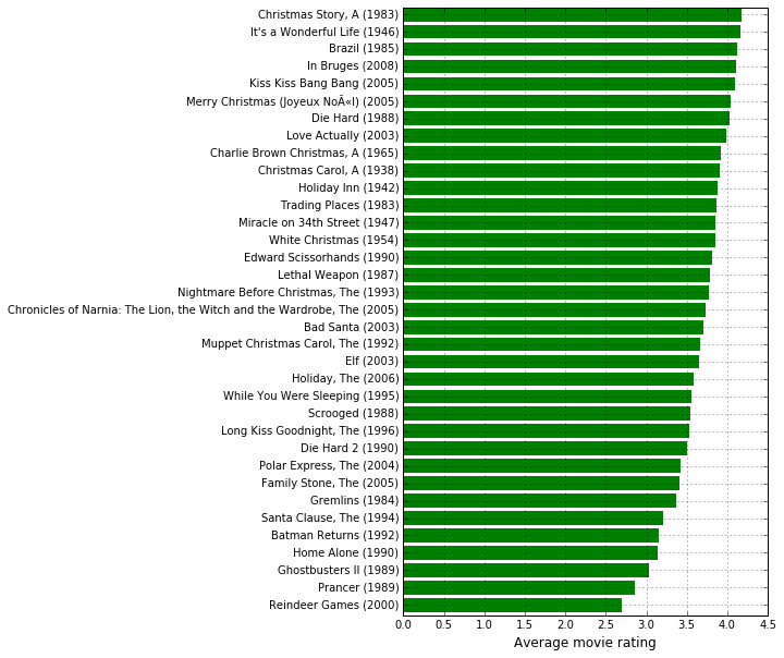
We find that the top ratied movies are, predictably, ‘A Christmas Story’ and ‘It’s a Wonderful Life’, while the worst rated movies are ‘Prancer’ and ‘Reindeer Games’. My two favourites performed well, with ‘Die Hard’ getting a rating of 4.03 and ‘Love Actually’ a rating of 3.99 out of 5.
Are Christmas movies rated differently in December compared to the rest of the year?
I then wondered whether the rating that MovieLens users gave to Christmas movies differed depending on whether they rated the movie in December compared to the rest of the year. On one hand, users may give movies higher scores around Christmas because they associate that movie with a feel-good holiday. On the other hand, they may give a movie a lower score because they are so sick of seeing it replayed on TV.
To do this, I ran two separate queries. One got the average score for a movie when the movie was rated between January to November, and the other the average score when it was rated in December.
# Average ratings for Christmas movies Jan-Nov

query = ("""\
SELECT *
FROM (
   SELECT movies.title AS "Title", AVG(ratingsdata.rating) AS avgr
   FROM movies
   INNER JOIN ratingsdata
   ON movies.itemid = ratingsdata.itemid
   WHERE movies.itemid IN (
      SELECT christmasids.itemid
      FROM movies
      INNER JOIN christmasids
         ON movies.itemid = christmasids.itemid)
   AND NOT MONTH(FROM_UNIXTIME(ratingsdata.timestamp)) = 12
   GROUP BY movies.title
) AS christmasratings
ORDER BY avgr DESC;
""")

cursor = cnx.cursor()
cursor.execute(query)
NotDec = DataFrame(cursor.fetchall(),
                   columns = ['Title', 'AverageRating'])
# Average ratings for Christmas movies in December

query = ("""\
SELECT *
FROM (
   SELECT movies.title AS "Title", AVG(ratingsdata.rating) AS avgr
   FROM movies
   INNER JOIN ratingsdata
   ON movies.itemid = ratingsdata.itemid
   WHERE movies.itemid IN (
      SELECT christmasids.itemid
      FROM movies
      INNER JOIN christmasids
         ON movies.itemid = christmasids.itemid)
   AND MONTH(FROM_UNIXTIME(ratingsdata.timestamp)) = 12
   GROUP BY movies.title
) AS christmasratings
ORDER BY avgr DESC;
""")

cursor = cnx.cursor()
cursor.execute(query)
Dec = DataFrame(cursor.fetchall(),
                columns = ['Title', 'AverageRating'])
I then merged these two DataFrames, and created a new column taking the difference of the average rating in December from the average rating during the rest of the year. Positive scores therefore mean the movie was rated better in December, while negative scores mean it was rated better during the rest of the year.
df2 = pd.merge(NotDec, Dec, left_on='Title', right_on='Title', how='outer')
df2['diff'] = df2['AverageRating_y'] - df2['AverageRating_x']
Finally, to present the graph in alphabetical order, I sorted the table by Title and reindexed the table.
df2 = df2.sort_values(by = 'Title')
df2.index = np.arange(0, len(df2), 1)
x = np.arange(len(df2))
idx = df2[df2['diff'] <= 0].index.tolist()

fig = plt.figure(figsize = (720/120, 1200/120), dpi = 120)
ax1 = fig.add_subplot(1, 1, 1)

barlist = plt.barh(x, df2['diff'], color = "g",
                   edgecolor='none')
plt.yticks(x + 0.4, df2['Title'])
plt.gca().invert_yaxis()
for i in idx:
    barlist[i].set_color('r')
plt.xlabel('Difference in score\n(positive scores indicate movie is rated better in December)', fontsize = 12)
plt.xlim((-0.35, 0.35))
plt.grid(True)
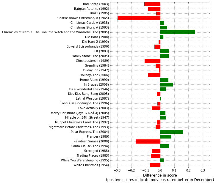
Unsurprisingly, movies such as ‘Elf’, ‘It’s a Wonderful Life’ and ‘The Polar Express’ are rated better in December than the rest of the year. ‘The Lion, the Witch and the Wardrobe’ also ranks better around Christmas than at any other time. However, one of the biggest surprises is how much worse ‘A Charlie Brown Christmas’ is rated at Christmas, falling 0.3 stars in December. Perhaps everyone is sick of seeing it? Hilariously, ‘Reindeer Games’, which was already the worst rated film on the list, is rated almost 0.2 stars lower around Christmas time.
How have Christmas movies been rated over time?
Christmas movies may have also grown more or less popular since they were released or introduced into the dataset. To have a look at the average rating of movies over time, we first run a MySQL query to get the average rating by movie and year:
query = ("""\
SELECT movies.title AS Title,
    YEAR(FROM_UNIXTIME(ratingsdata.timestamp)) as Year,
    AVG(ratingsdata.rating) AS AverageRating
FROM movies
INNER JOIN ratingsdata
ON movies.itemid = ratingsdata.itemid
WHERE movies.itemid IN (
    SELECT christmasids.itemid
    FROM movies
    INNER JOIN christmasids
        ON movies.itemid = christmasids.itemid)
GROUP BY movies.title, Year;
""")

cursor = cnx.cursor()
cursor.execute(query)
df3 = DataFrame(cursor.fetchall(),
               columns = ['Title', 'Year',
                          'AverageRating'])
Some of the movies only have a couple years of data as they were either recent releases or only recently introduced into the dataset. In order to get a good idea of the ratings over time, I limited the data to those movies that have at least 5 years worth of data, and then took the difference of the first year from the last year, meaning that movies that have a positive difference have been rated better in more recent years.
g = df3.groupby('Title')
size = (g.size() >= 5)
df4 = df3[df3['Title'].isin(size[size].index)]
df4 = DataFrame(df4.groupby('Title').last()['AverageRating'] -
                df4.groupby('Title').first()['AverageRating'])
I then created moved the movie titles into a column (rather than letting them be the DataFrame’s index) and made the index numeric to make the graphing easier (the code that changes the bar colours needs a numeric index).
df4['Title'] = df4.index
df4.index = np.arange(0, len(df4), 1)
x = np.arange(len(df4))
idx = df4[df4['AverageRating'] <= 0].index.tolist()

fig = plt.figure(figsize = (720/120, 1200/120), dpi = 120)
ax1 = fig.add_subplot(1, 1, 1)

barlist = plt.barh(x, df4['AverageRating'], color = "g",
                   edgecolor='none')
plt.yticks(x + 0.4, df4['Title'])
plt.gca().invert_yaxis()
for i in idx:
    barlist[i].set_color('r')
plt.xlabel('Difference in score\n(positive scores indicate movie has been rated better in recent years)',
           fontsize = 12)
plt.xlim((-1.7, 1.7))
plt.grid(True)
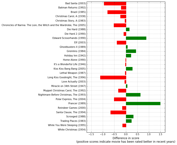
Both of Tim Burton’s Christmas movies, ‘Edward Scissorhands’ and the delightful ‘The Nightmare Before Christmas’, have increased in popularity over time (probably as people realised these were two of his last good movies). Interestingly, a few of the movies that generally rate better in December have rated more poorly over time, with ‘Elf’ and ‘Polar Express’ losing around half a star each between their release years and 2009. ‘It’s a Wonderful Life’, as well as my favourites ‘Die Hard’ and ‘Love Actually’ did not show much change over time, indicating they have been consistently highly rated. Similarly, ‘Reindeer Games’ and ‘Home Alone’ also did not show much change, indicating they have always been poorly received.
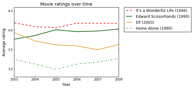
Below I will show a line plot of ratings from 2003-2009 with an example of each kind of trend over time. You can see ‘Edward Scissorhand’s ratings rise over the 6 years, while ‘Elf’s fall. Meanwhile, ‘It’s a Wonderful Life’ hovers consistently around 4.2 and ‘Home Alone’ can’t get above 3.4 (fully deserved, that movie is terrible).
# Plot a movie rising in popularity, one that is always popular, one falling in popularity, and one always unpopular

fig = plt.figure(figsize = (720/120, 500/120), dpi = 120)
ax = fig.add_subplot(1,1,1)

# Add lines
plt.plot(df3['Year'].loc[df3['Title'] == df4['Title'][14]],
         df3['AverageRating'].loc[df3['Title'] == df4['Title'][14]],
         color='#FF0000', linestyle='dashed', linewidth=2.0,
         label = df4['Title'][14])
plt.plot(df3['Year'].loc[df3['Title'] == df4['Title'][8]],
         df3['AverageRating'].loc[df3['Title'] == df4['Title'][8]],
         color='#065A00', linewidth=2.0,
         label = df4['Title'][8])
plt.plot(df3['Year'].loc[df3['Title'] == df4['Title'][9]],
         df3['AverageRating'].loc[df3['Title'] == df4['Title'][9]],
         color='#DFA226', linewidth=2.0,
         label = df4['Title'][9])
plt.plot(df3['Year'].loc[df3['Title'] == df4['Title'][13]],
         df3['AverageRating'].loc[df3['Title'] == df4['Title'][13]],
         color='green', linestyle='dashdot', linewidth=2.0,
         label = df4['Title'][13])

# Add labels
plt.xlabel('Year', fontsize=12)
plt.ylabel('Average rating', fontsize=12)
plt.title('Movie ratings over time', fontsize=14)

# Set x-axis
plt.xlim((2003, 2008))
ax.get_xaxis().get_major_formatter().set_useOffset(False)

# Create legend
plt.legend(bbox_to_anchor=(1.05, 1), loc=2, borderaxespad=0.)

plt.show()
What genres are Christmas movies?
I will end this post by looking at the most common genres of Christmas movies. We run a final MySQL query to extract the number of movies tagged with each genre. We can also now close our connection (using cnx.close()) as we are finished our queries.
query = ("""\
SELECT SUM(movies.action) AS Action,
      SUM(movies.adventure) AS Adventure,
      SUM(movies.animation) AS Animation,
      SUM(movies.childrens) AS Childrens,
      SUM(movies.comedy) AS Comedy,
      SUM(movies.crime) AS Crime,
      SUM(movies.documentary) AS Documentary,
      SUM(movies.drama) AS Drama,
      SUM(movies.fantasy) AS Fantasy,
      SUM(movies.noir) AS Noir,
      SUM(movies.horror) AS Horror,
      SUM(movies.musical) AS Musical,
      SUM(movies.mystery) AS Mystery,
      SUM(movies.romance) AS Romance,
      SUM(movies.scifi) AS SciFi,
      SUM(movies.thriller) AS Thriller,
      SUM(movies.war) AS War,
      SUM(movies.western) AS Western
FROM movies
WHERE movies.title IN (
   SELECT DISTINCT movies.title
   FROM movies
   LEFT JOIN ratingsdata
      ON movies.itemid = ratingsdata.itemid
   WHERE movies.itemid IN (
      SELECT christmasids.itemid
      FROM movies
      INNER JOIN christmasids
         ON movies.itemid = christmasids.itemid));
""")

cursor = cnx.cursor()
cursor.execute(query)
df5 = DataFrame(cursor.fetchall(),
               columns = ['Action', 'Adventure', 'Animation',
                          'Childrens', 'Comedy', 'Crime',
                          'Documentary', 'Drama', 'Fantasy',
                          'Noir', 'Horror', 'Musical', 'Mystery',
                          'Romance', 'SciFi', 'Thriller', 'War',
                          'Western'])
cnx.close()
Looking at the first 5 columns, you can see the data have been returned with a separate column per genre. This is not very helpful, so will require a little bit of wrangling to get it into a suitable form for graphing.
df5.ix[:,:5]
| Action | Adventure | Animation | Childrens | Comedy | |
|---|---|---|---|---|---|
| 0 | 9 | 3 | 3 | 9 | 22 |
df5 = df5.transpose()
df5.columns = ['Count']
df5 = df5.sort_values(by = 'Count', ascending = 0)
Now we have a transposed table that is sorted by the number of movies in each genre. Remember that movies can have more than one genre tag, so this table sums to more than 35. Here are the first 5 rows:
df5[:5]
| Count | |
|---|---|
| Comedy | 22 |
| Drama | 12 |
| Fantasy | 12 |
| Romance | 10 |
| Action | 9 |
Now we can plot the frequency of each genre using a barplot.
x = np.arange(len(df5))

fig = plt.figure(figsize = (720/120, 800/120), dpi = 120)
ax1 = fig.add_subplot(1, 1, 1)

barlist = plt.barh(x, df5['Count'], color = "r",
                   edgecolor='none')
plt.yticks(x + 0.4, df5.index)
plt.gca().invert_yaxis()
plt.xlabel('Number of movies with genre tag', fontsize = 12)
plt.grid(True)
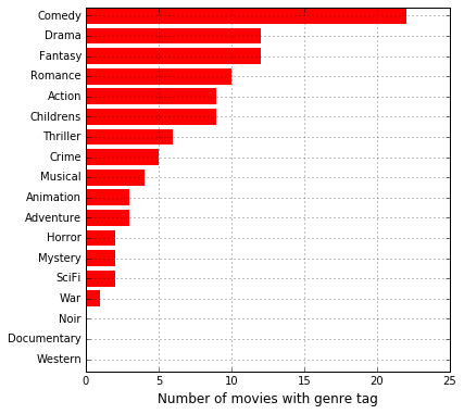
Unsurprisingly, comedy is by far and away the dominant genre, followed by drama, fantasy and romance. There are a surprisingly small number of musicals or animated movies, and a very high number of action movies, given the family-friendly nature of the holiday. There are also, oddly enough, two movies tagged as horror (‘Gremlins’ and ‘Ghostbusters II’) which seems a little incongruous for the Christmas season (though to be fair, they are both pretty ridiculous horror movies!).
And that’s it! I hope you’ve enjoyed the analysis and have a safe and Merry Christmas!

