Making beautiful plots in Python (plus a shameless book plug!)
When I transitioned over to working primarily in Python from R, one of the things that I missed was ggplot2. For me, the plots in ggplot2 look so much nicer and the syntax is more intuitive compared to matplotlib. Happily, last year I discovered that Hassan Kibirige has made a comprehensive port of ggplot2 to Python called plotnine. Although Hassan is still developing the package, I’ve found that the port is fairly complete and there is not much I’m unable to do in plotnine that I could do in the original ggplot2.
In fact, the port is so good that Mauricio and I have written a technical book about how to get the most out of plotnine. This book is an adaptation of our popular The Hitchhiker’s Guide to Ggplot2, but written entirely in Python using the plotnine package, and it’s (very originally) called The Hitchhiker’s Guide to Plotnine. Like in the original ggplot2 book, we’ve written chapters on a wide range of graphs, from line and bar graphs, scatterplots and boxplots, through to histograms, linear regression graphs and LOWESS plots. Using plotnine, we have been able to recreate graphs that are very true to the original ggplot2 style and degree of customisation.
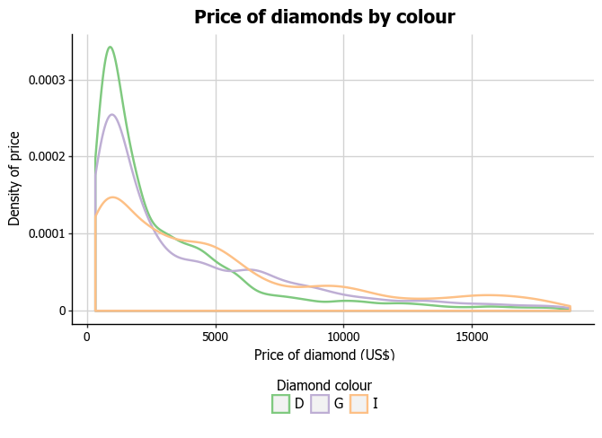
For example, you can create charts like the density plot below, with customisation on the fonts, fill, background layout and legend.
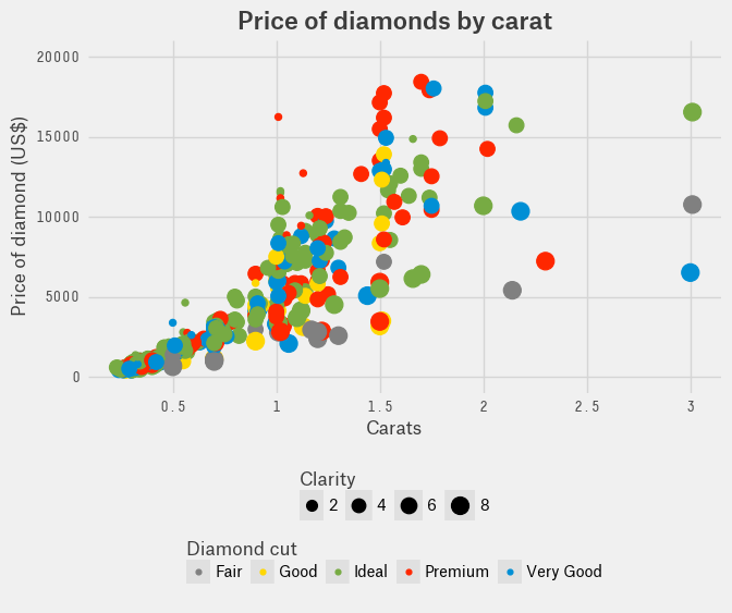
You can also use plotnine to recreate the styles of other publications. For example, this weighted scatterplot was created in the style of fivethirtyeight.
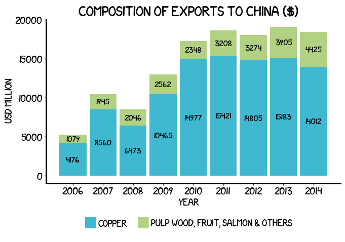
We’ve been able to recreate the XKCD style plots we made for our previous book, entirely in plotnine.
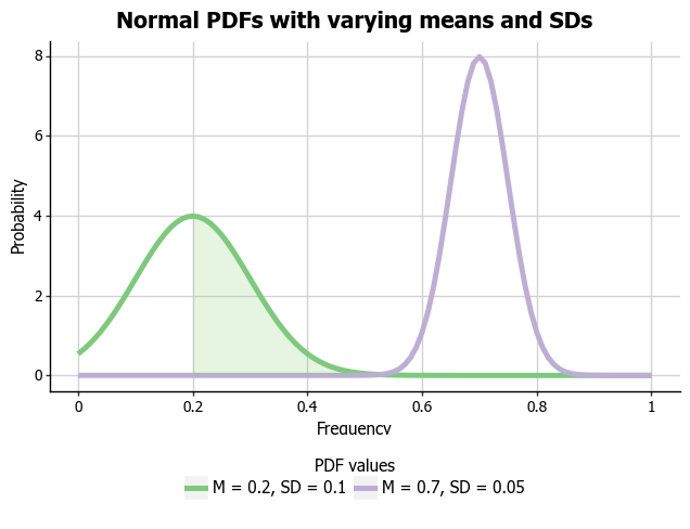
plotnine also allows you to go beyond simpler plots like bar and scatterplots, and create more advanced statistical visualisations. In the plot below, you can see we’ve combined the capabilities of the scipy package with plotnine to chart some probability density functions.
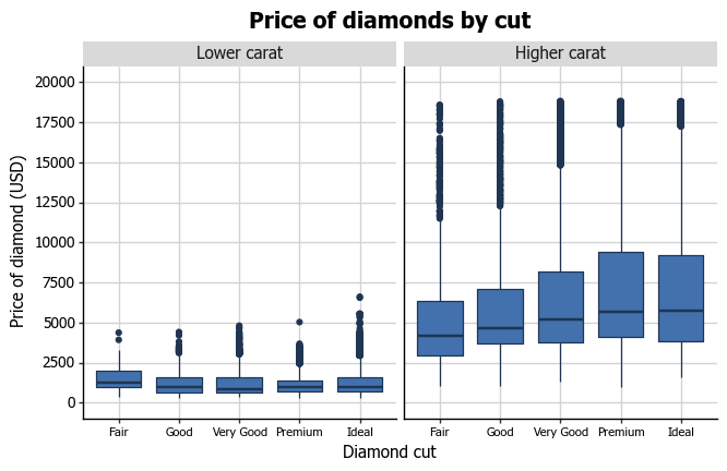
The package also includes the useful faceting functions that are used in ggplot2, so you can create subplots like the one below.
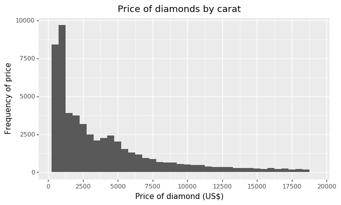
Hassan has made the syntax of plotnine as close to that of ggplot2 as possible, so the overall experience is quite intuitive for someone who is familiar with using ggplot2. For example, in order to create a histogram with a customised title and axis labels, as in the code below, you can see that you use the same ggplot() and geom_histogram() functions to create the plot that you would use in R. You can also see that, like in R, you can specify the metric used by the histogram, its binwidth, and the spacing of the x-axis, although you can see we’ve used numpy‘s arange function to create the breaks rather than the seq function you might use in R. Finally, plotnine uses the same ggtitle, xlab and ylab functions to allow you to label your title and your axes.
p7 = (
  ggplot(diamonds, aes("price"))
  + geom_histogram(aes(y="..count.."), binwidth=500)
  + scale_x_continuous(breaks=np.arange(0, 22500, 2500))
  + ggtitle("Price of diamonds by carat")
  + xlab("Price of diamond (US$)")
  + ylab("Frequency of price")
     )
p7
Overall, I really recommend plotnine as an alternative to matplotlib in Python, especially for when you need to create presentation-ready charts. Our book is available on Leanpub, should you need some extra help learning how to use the package or want to push your charts to the next level. Finally, I want to give a huge thanks to Hassan for all of his hard work in building and maintaining this wonderful implementation of ggplot2 in Python!
